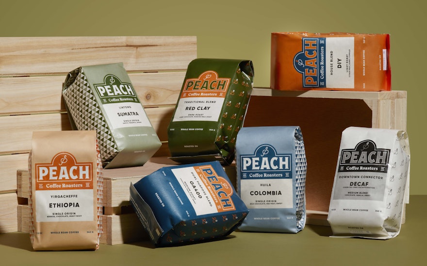
Pentagram’s Austin office has designed a comprehensive new brand identity system and updated packaging for the Atlanta, Georgia based Peach Coffee Roasters.
There are a lot of peachy things in Atlanta. Georgia is known as “The Peach State,” because of its abundant orchards and bountiful peach crop, but there is more to the story of Atlanta’s history with the peach. There’s a major thoroughfare that passes through the sprawling southern city called Peachtree, named after Peachtree Creek, and within Atlanta’s city limits there are fifteen separate streets called Peachtree. It is also believed that the indigenous people of Atlanta called the pine trees in the area “Pitch Trees,” and over time that name morphed into Peachtree.
Peach Coffee Roasters is a friendly, down-home operation with two cozy coffee shops in the Atlanta area–one in Johns Creek and one in Westside Atlanta–and a loyal band of proud Georgia-native supporters.
Peach is passionate about single-origin coffees and carefully crafted blends. They have three licensed Coffee Q-Graders who select the best beans from around the world and roast them to perfection. This dedication to quality extends throughout every step of their process, from their brewing methods to small-batch roasting to green coffee sourcing. Peach’s goal is to provide their customers and local coffee shop partners with the highest quality coffee possible and a healthy dose of southern hospitality with every cup.
One of the challenges the design team faced is that the “Peach Coffee Roasters” name has occasionally been misunderstood to mean coffee made or blended with peaches. To remedy this confusion, the Pentagram team limited the use of the color peach and designed a simple, easy-to-read labeling system–featuring a sans-serif typeface called Gilroy (by Radomir Tinkov) in all caps and ample white space–that clearly identifies the name, flavor profile and origin of the coffee, leaving no doubt that the content of the newly-designed bags is indeed coffee, not peaches. The coffee bags themselves are compostable and fully in line with Peach Coffee Roasters commitment to sustainability.
On the other hand, the new Peach Coffee Roasters logotype was directly influenced by peaches and other produce. The design team researched vintage fruit-crate labels, especially old Georgia peach labels, and created an original wordmark emblem that stylistically harkens back to those early days of agriculture. The new colors for Peach Coffee Roasters include a lovely orange shade that can actually be found in the skin of a peach, a deep indigo blue and forest green. These shades were chosen to evoke images of the south and are complimented with a set of lighter tints used primarily in the updated packaging scheme.
A set of new graphic patterns were created alongside the new color palette, featuring a classic gingham pattern inspired by Sid Mashburn, an Atlanta-based menswear legend who is also a friend and enthusiastic supporter of Peach Coffee Roasters.
In addition to the new Peach emblem, the Pentagram team created two new icons that can be used by themselves as supplementary identity tools. The new icons include a script letter “P” that references a popular neon sign affixed to the wall in the Johns Creek location, and a logo of a “pointer,” a breed of dog used in the traditional southern pastime of duck hunting.
The hunting dog, named “Peaches” of course, serves as the new mascot for the brand that will gain recognition over time and maybe someday a living, breathing, pointing “Peaches” will become a regular at the Peach coffee shops.

