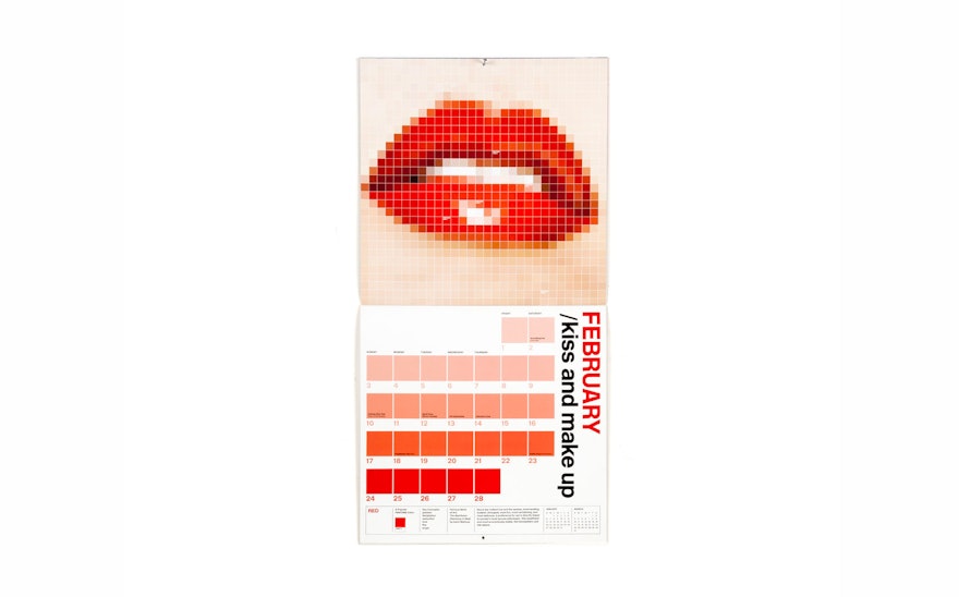
Pantone is the influential global brand known for its Pantone Matching System (PMS) that enables designers and printers to specify and reproduce accurate color. The company has been working to increase its presence in the digital sphere, and Pentagram was hired to design the Pantone 2013 Calendar to re-contextualize the familiar PMS chips into colorful “digitized” images for each month. The “pixels” of the images resemble the chips, with colors identified as specific PMS numbers.
Pantone also famously forecasts an official “color” for the coming year—Emerald 17-5641 is the color of 2013—and the calendar similarly selects a color for each month, represented in the images as well as in playful taglines like “Tickled Pink” and “Mellow Yellow.” The grid of the wall calendar looks like a series of Pantone color chips, with the days of the month ranging through the shades of the featured color. In the engagement calendar these shades appear along the side, like a specifier.
The wall calendar also features concepts suggested by the color (passion, love, etc.), the color's appearance in famous works of art (like Matisse’s Red Room) and what liking the color may mean about you. The font used in both versions of the calendar is New Rail.

