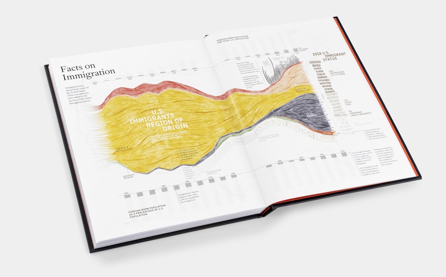
Immigration is one of the most pressing policy issues facing the US today—as it has been throughout much of American history. Pentagram partner Giorgia Lupi and team have created a pair of data visualizations that provide an overview of immigration trends in the country and the various pathways to becoming a citizen. The infographics were commissioned for Out of Many, One: Portraits of America’s Immigrants, a new collection of oil paintings by President George W. Bush, published by Crown.
The book features 43 portraits of people who immigrated to the US, each accompanied by a personal narrative of their experience. The book and accompanying portraits champion the ways immigrants have strengthened the US.
Presented at the close of the book, the data visualizations offer a broader view of immigration as a national issue. The topic was especially important to Giorgia, who is an immigrant to the US herself and knows what the immigration process is like firsthand. Like much of her work, the project utilizes the principles of “data humanism”—using data to uncover the human stories behind the numbers and statistics.
The first visualization centers on a timeline that shows how immigration has ebbed and flowed over the years. Immigrants’ region of origin is color coded, shifting from Europe and the Middle East to Asia and Latin America. The information is represented in brush-like strokes that evoke the oil paintings in the book.
Details layered at the edge of the wave feature subsets like the number of refugees and asylees admitted to the US, and immigrants awarded the Nobel Prize—one third of all US prize-winners. A graph at the top and bottom measures foreign-born population as a percentage of the US population, and a sidebar breaks down 2018 US immigrant status.
The second infographic functions as a kind of immigration road map, showing how complex the process is to become a citizen. Adapted from an existing graphic, the visualization is structured like a yes/no flowchart, organized around the four main pathways to obtaining a green card—through employment, diversity, family or investment.
The visual complexity of the chart illustrates how difficult it really is to become an American, but also serves as a helpful guide. The steps are written in the second-person point of view, as though the reader is confronting these challenges themselves. At the end of each chain, the chart notes how many people successfully made it through the path. A light painterly effect in the background represents how many immigrants apply for cards, how many receive them—and how many get stuck in the application backlog.

