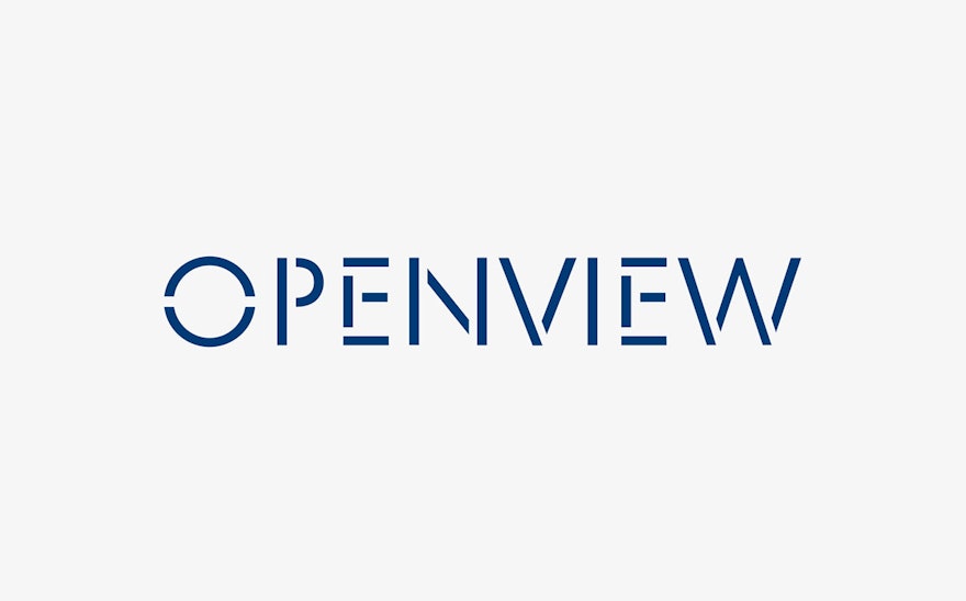
OpenView is a Boston-based venture capital firm that exclusively invests in and helps grow expansion-stage software companies to their full potential. Pentagram has developed a new brand strategy and identity for OpenView that reflects their unique hands-on approach. As part of the process, the designers worked with the company to develop everything from their brand positioning and tone of voice, to a new wordmark and custom fonts, to the website and physical spaces.
The designers collaborated closely with OpenView leadership, who work in direct partnership with their own clients and act as mentors to help them acquire, retain and grow the right customers and talent. The firm needed branding that would clearly communicate this one-on-one relationship and fundamental involvement, as well as define their own distinctive brand voice and an overarching strategy that would establish consistency, clarity and hierarchy in their communications.
The Pentagram designers immersed themselves in the culture of OpenView, conducting a series of interviews with leadership and employees, and collecting insights about how the OpenView team talks to their portfolio companies, and how they want their network to talk about them. Working with the firm, the designers helped the company identify five desired brand attributes: “constructive,” “agile,” “honest,” “rigorous,” and “personable.”
Language inspired by the expansion process has been leveraged to clearly convey the firm’s relationship with their portfolio companies and audiences. The designers developed brand architecture that uses action verbs to name the company’s various groups and brand channels: OpenView Invest for the investment team, OpenView Grow for the expansion team, and OpenView Learn for thought leadership platforms.
To create a bold and confident identity in line with OpenView’s productive approach, the designers developed a fresh take on stenciling, a centuries-old form of typography universally known for its ease and efficiency. The designers developed a custom stencil typeface called OpenView Stencil, which evokes the company’s pragmatic spirit, vitality and no-nonsense attitude with a utilitarian quality that reflects the methodology of the firm and sets it apart from the typically over-polished, graphically conservative identities used by VC branding to convey ideas of tech and finance.
Built of simple geometric forms, the stencil font is literally open, illustrating the name of the company while also suggesting the agile, honest and constructive brand attributes. The logotype is accompanied by a secondary logo, an abbreviated version of the full wordmark that functions as a monogram with “OV.” The custom stencil typeface has been extended into two additional weights, regular and bold, which are used for text and secondary typography.
The primary brand color is deep blue, accented by a palette of bright, optimistic secondary colors. The clean geometry and openness of the typography has been expanded into a system of custom icons that depict characteristics of the company and stages of the VC process, as well as universal icons used in office signage.
The branding extends to a full program of environmental graphics for the OpenView offices in Boston. Staff and visitors are greeted by the “OV” logo rendered in bright blue neon, a strong and industrious but no-frills symbol that echoes the company’s new tagline, “We Power Expansion.” Signs set in OpenView Stencil and custom icons seamlessly integrate the identity throughout the interiors, helping the headquarters to visually exemplify the company’s mission.

