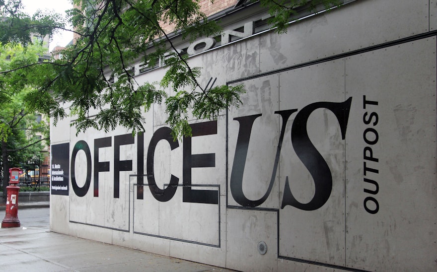
OfficeUS, the U.S. Pavilion at the 14th International Architecture Exhibition in Venice, opened with an identity, environmental graphics and publications designed by Pentagram. Conceived as a working architecture office, the installation explores the ways in which U.S. architectural practice has influenced the discipline worldwide over the past 100 years. Pentagram's identity for the Pavilion provides a dynamic visual language that is built out of the simple efficiency of office culture.
The designers worked on the project as part of a team organized by the Storefront for Art and Architecture in collaboration with PRAXIS Journal, and with research lead by the MIT Department of Architecture. The group was selected by the U.S. Department of State to represent the U.S. at the Biennale. The New York-based architecture firm Leong Leong developed the Pavilion design.
The 2014 Venice Architecture Biennale is directed by the architect Rem Koolhaas and centers on the theme “Fundamentals.” Over the course of five-month Biennale, OfficeUS will function as an active workspace that will research and remake key architectural projects from an onsite repository of 1,000 export projects created by 200 U.S.-based firms working around the world since 1914. Investigating, dissecting, and reconstructing these projects, the partners and researchers of OfficeUS will use 25 critical “issues” as a lens examine how U.S. architectural practice has shaped architecture worldwide, and conversely, how international events have impacted this history of architecture as an American export.
Inspired by the "Fundamentals" theme and the context of a working office, Pentagram's identity for the U.S. Pavilion utilizes the ubiquitous, workaday fonts Times New Roman and Arial, default typefaces found on both Macs and PCs. The typography of the OfficeUS wordmark has been carefully calibrated to show the fonts at their best.
The typefaces became the basis for an extended system of templates for the binders used to display the 1,000 projects and other publications produced by OfficeUS. In addition to contributing to the context of office culture, the use of accessible fonts enables the partners and researchers to create documents and collateral that are inherently part of the graphic system, effectively expanding the design team from three or four people into a 30-person team. A black-and-white color palette complements the elemental look of the program, which also includes office-related icons and symbols, detailed charts and infographics, and historic photography of the architectural works.
Leong Leong’s design for the exhibition centers around a large working table where the OfficeUS partners and researchers will analyze projects in the repository and produce new content. The table functions as both desk and display case; the transparent acrylic desktop reveals the branded materials stored inside, which include the OfficeUS catalogues, elements of the binder system and other exhibition collateral, as well as typical architectural tools and office supplies.
Pentagram designed a series of four publications for the exhibition—Agenda, Atlas, Manual, and New World—published by Lars Müller Publishers. A wide range of original content was created for the books, including detailed infographics, maps and timelines that reveal patterns and trends of U.S. export architecture. The first volume is available now.
The repository of 1,000 researched projects are presented in a series of binders that wrap around the walls of the office. The designers developed a uniform cover design that represents each project with a single image. Displayed chronologically, the wall itself functions as a giant infographic: historical trends and visual narratives can be seen across the covers, such as the prevalence of certain architectural styles, projects that center on various parts of the world, or the rise of color photography to document work. These trends are further highlighted by title cards that announce the 25 issues used to organize the exhibition content (“Cargo Cults,” “Oil Exports,” etc.) When binders are removed from the shelves, the staff fill the empty spots with placeholder cards that read “Borrowed” or “Walked Away.”
Additional coverage: Architizer, Wired, Designboom.

