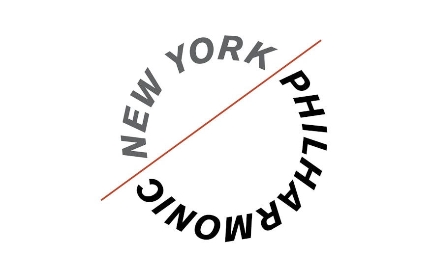
In 2009 the New York Philharmonic announced its 2009–2010 season by introducing a new graphic identity designed by Pentagram. Founded in 1842, the New York Philharmonic is the oldest active symphony orchestra in the United States. The organization was seeking a new institutional identity to coincide with Alan Gilbert's beginning as its next music director starting with its 2009–2010 season. (The appointment is particularly exciting for the Philharmonic as Gilbert is considered family—he is the first native New Yorker to hold the post and both of his parents were violinists for the company.)
The Philharmonic has always been well regarded for its eminent conductors, and the new identity takes as its inspiration the graphic line of the baton. The baton icon bisects a circular wordmark, set in italic Akzidenz Grotesk, that emphasizes the dynamism of the organization. Many symphony orchestras represent themselves with logos adapted from musical notation. The new identity establishes a distinctive, original mark that is reminiscent of musical symbols while at the same time being wholly new and contemporary. One of the goals was to create a mark that would be universally recognizable, as the Philharmonic is internationally renowned and performs all over the world—in 2008, it was invited to perform in North Korea, and became the first U.S. performing arts group to visit the country since the end of the Korean War.
Pentagram previously designed identities for two of Lincoln Center’s other major constituents, The Metropolitan Opera (2006) and New York City Ballet (2008). (We also designed the identity for Jazz at Lincoln Center when it moved from the campus to its own home in the Time Warner Center in 2004.) For the designers, it was important that the Philharmonic identity stand apart from the other organizations' logos without appearing out of place.
The Philharmonic's institutional identity has a built-in flexibility that can accommodate the varied needs of the organization. The two elements—the circular wordmark and the line graphic—may appear together or apart, in multiples, rotated or layered, to create patterns of line and shape. The line of the baton may be used as a decorative motif or to set apart blocks of information. The system uses a strong, bold color palette that can be updated seasonally and is paired with elegant black and white photography of the musicians.
The identity will be applied to the Philharmonic’s institutional communications and promotion material including programs, brochures, calendars, tickets and the website, as well as environmental graphics for its home in Avery Fisher Hall at Lincoln Center.

