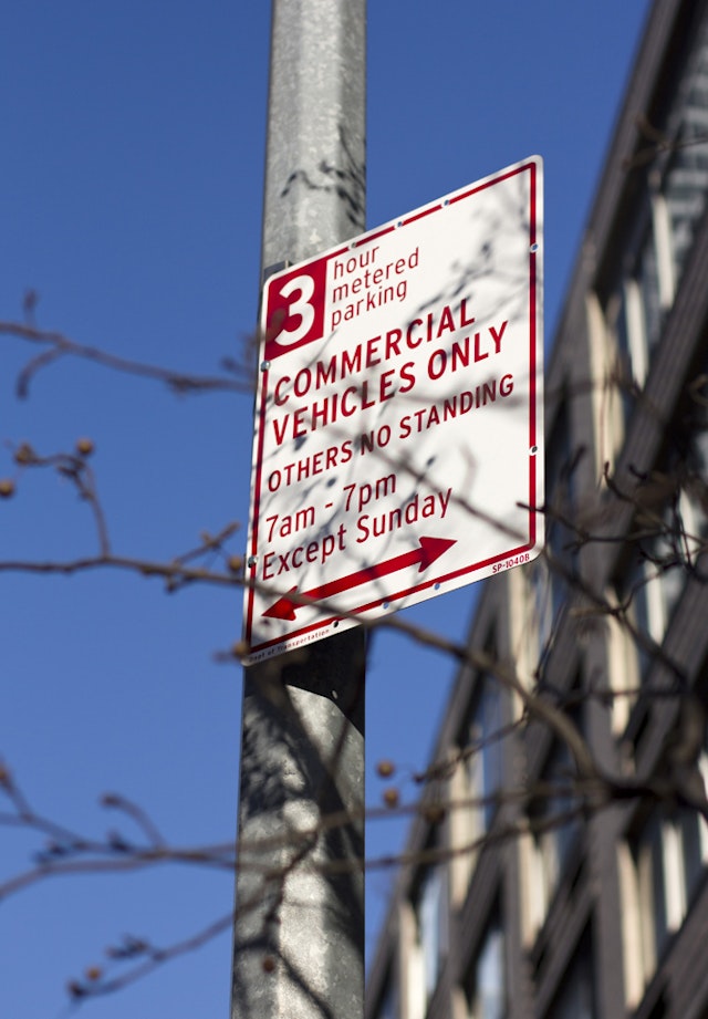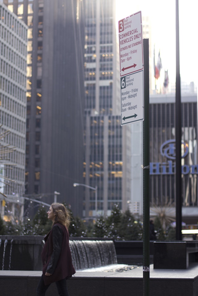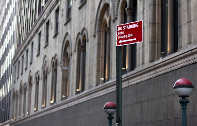


The new design introduces a consistent, simplified layout that cuts back on the number of words and colors and adds some much-needed white space.


New York drivers often arrive in confusion when parking their cars on city streets; the thrill of finding an empty spot is quickly replaced by the "huh?!" of trying to decipher a jumble of posted restrictions and possible fines. Pentagram has worked with the New York City Department of Transportation (DOT) to create a new, simplified design for parking signs that are more easily understood and may result in fewer parking tickets for New Yorkers. The redesign was introduced in 2013 by Transportation Commissioner Janette Sadik-Khan and other city officials at a press conference in Midtown, where 450 signs had already been installed.
The existing signs were densely packed with information that was wordy and hard to follow. Typography was centered and set in all caps in various fonts and sizes, making it difficult for the eye to scan. Messages were stacked on different placards in various combinations up to 60" high, with restrictions for commercial vehicles in red and passenger vehicles in green joined by additional signs in blue reminding drivers to pay at the Muni-Meter.
“New York City’s parking signs can sometimes be a five-foot-high totem pole of confusing information,” said Commissioner Sadik-Khan. "We used to have signs with 250 characters on four different signs in three different colors." The indecipherable design was the punch-line of a recent episode of Louis C. K.’s “Louie,” in which the comedian couldn’t figure out whether parking was allowed or not and had his car crushed by a DOT vehicle.
The new design introduces a consistent, simplified layout that cuts back on the number of words and colors and adds some much-needed white space. The signs are divided into two sections, one for commercial vehicles (still in red), the other for passenger vehicles (in green). The number of hours parking is allowed is prominently placed in a reversed-out box at the top left of the sign. Everything is aligned to the left, and typography appears in both upper and lower case, set in a uniform font, Highway, widely used in US DOT signage. The superfluous blue signs have been eliminated altogether; Muni-Meters have been the only way to pay for single-space parking since 2011. The new signs are shorter—no taller than 48”—and hence more efficient to fabricate.
DOT had already been developing clearer language for the signs when the designers began to work on the layouts. Redundant language ("6 hour parking from 6 pm to midnight") has been eliminated or reduced and the number of characters explaining the rules on each sign pared from 250 to about 140—perhaps showing the influence of Twitter. The designers and DOT tested variables with various groups of New Yorkers to arrive at the most easily understood messaging. For instance, the hierarchy of information has been changed, with days now listed before hours. The tone of the language is now permissive rather than prohibitive, telling drivers what they can do rather than what they can’t.
The simplified signs will be located throughout Manhattan's paid commercial parking areas, running generally from 60th Street downtown to 14th Street and from Second to Ninth Avenues, with additional areas in the Upper East Side, Lower Manhattan and the Financial District. The 6,300 signs that DOT will replace in Midtown and Lower Manhattan include 3,300 commercial parking signs and 3,000 other signs for nighttime and weekend parking for the general public. Future phases will extend the program to commercial areas in the outer boroughs.
Pentagram previously worked with DOT on a citywide pedestrian wayfinding system and the LOOK! campaign to promote crosswalk safety.
Sector
- Transport
Discipline
- Signage & Environmental Graphics
Office
- New York
