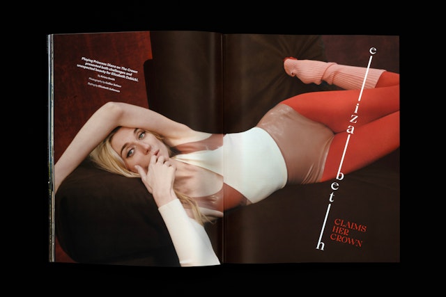
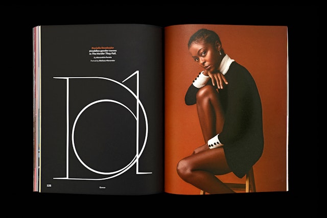
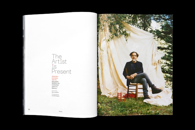
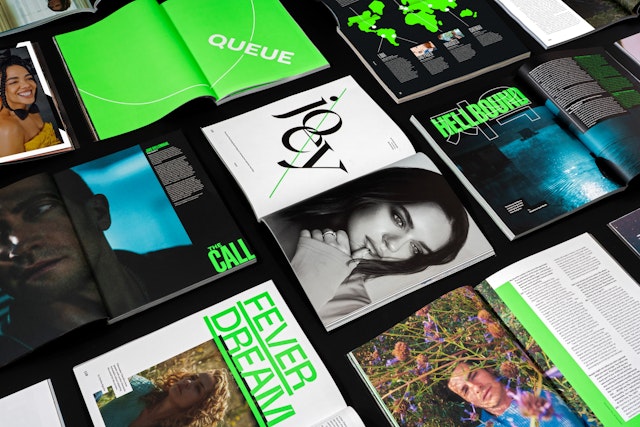
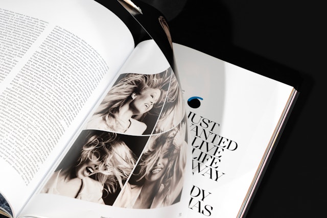
Each issue takes the reader on an unexpected visual journey, moving from dramatic photography to dynamic typography, from interludes of quiet elegance to graphic statements and vibrant colors.
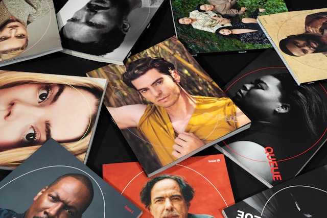
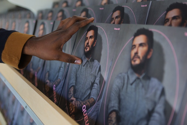
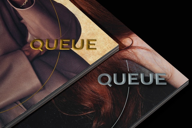
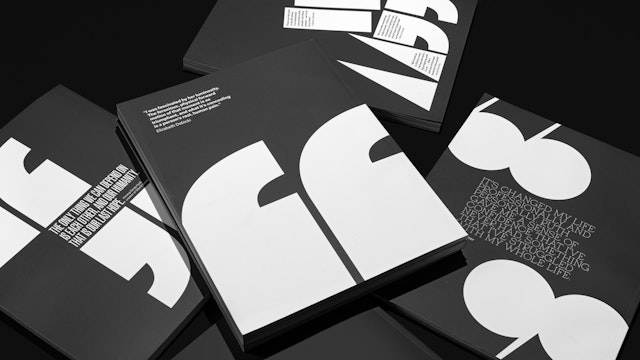
Every article’s design echoes the story of the Netflix original title being featured. As a result, each issue is eclectic yet somehow cohesive.
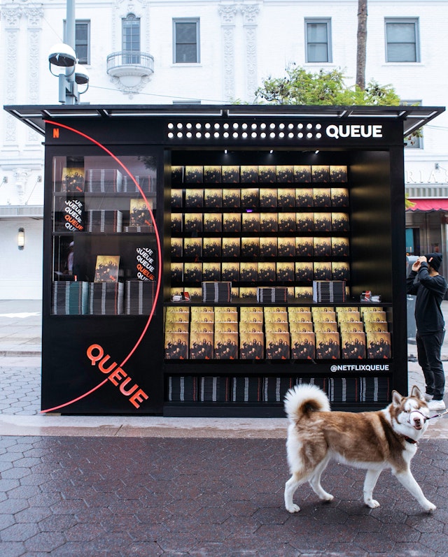

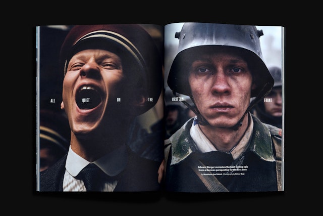
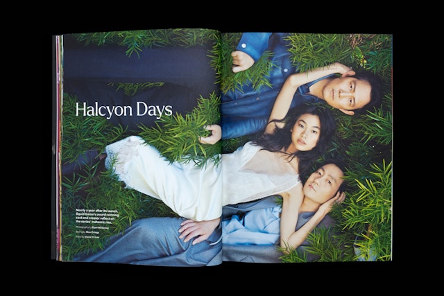
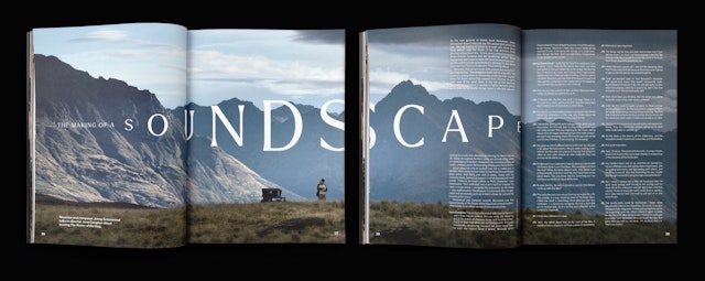

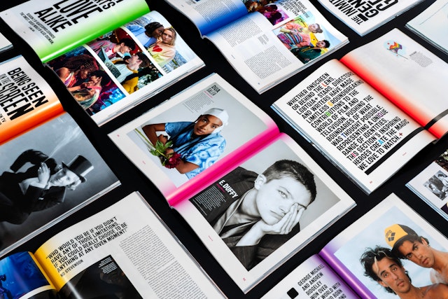
Standalone special issues, including a zine geared toward a young-adult audience, embrace their own unique aesthetics.

Netflix, one of the world’s leading entertainment services, is known for its staggering breadth of content. But within its impressive library lives a host of award-worthy original films and series created by top-tier talent. For more than five years, Pentagram has collaborated with Netflix to produce an editorial ecosystem with a mission to tell “the story behind the story” of these prestige titles.
The streamer first engaged Pentagram in 2019 to design, name, and launch the inaugural issue of Queue journal. Since then, Pentagram and Netflix have partnered to publish 19 print editions of Queue (Issue 20 is expected to debut in the first half of 2025).
While a few elements remain constant across issues — the cover treatment, a front-of-book section featuring full-bleed imagery, a back-of-book section of repeatable columns, and a standing set of five typefaces — the design styles and color palettes change regularly. Issue 5, for example, features a bold neon green throughline, and a series-focused Issue 8 employs television color bars on the page edges. Special sections incorporate distinctive iconography, typefaces, and colors to embody the section’s theme: documentary, animation, LGBTQIA+ talent, global storytelling. World-class photographers (including Inez & Vinoodh and Ryan McGinley) and illustrators (such as Shyama Golden, Paulina Almira, and Barry Falls) have contributed original work to its pages. Standalone special issues, including a zine geared toward a young-adult audience, embrace their own unique aesthetics.
Queue is a talent-first publication that strives to give each actor, director, artist, craftsperson, film or series to have its own spotlight moment. So, each issue takes the reader on an unexpected visual journey, moving from dramatic photography to dynamic typography, from interludes of quiet elegance to graphic statements and vibrant colors. Some compositions mimic or enhance the imagery; others let the photography breathe. Every article’s design echoes the story of the Netflix original title being featured. As a result, each issue is eclectic yet somehow cohesive.
While Queue was conceived as a print journal, the brand expanded into digital during the pandemic. Pentagram began designing biweekly digital covers, animating the oval Q logo over an image or video. Each logo animation lives in the world of the image itself, encircling the subject with custom visuals. The digital covers also anchor Queue’s website, which Pentagram designed, building upon the visual language of the print publication.
Since Queue’s 2019 launch, Netflix has earned more Academy Award nominations than any other individual movie studio, and tied a longstanding record for most Emmy Award wins in a single year. Queue has supported these achievements by helping industry folks learn the stories behind the stories of Netflix’s premium films and series. Likewise, Pentagram’s design work on both the print and digital arms of Queue has garnered multiple medals from the Society of Publication Designers.
Office
- New York
Partners
Project team
- Chad McCabe
- Virginia Shannon
- Patrick Crowley
- Elizabeth McMann
- Jase Hueser
- Ben Law
- Anna LaGrone
- Liam Hamill
- Jordan Taylor
- Gracia Lee
- Rob Hewitt
- Janny Ji
- Shivam Sinha
- Shigeto Akiyama
- Laura Berglund
- Timothy Cohan
- Jenny Hung
- Steven Merenda
- Shira Inbar
- Shannon Jager
- Joey Petrillo
- Ayanna Quint
- Amy Hoppy
- Michael Houtz
- Emily Kehe
- Hanna Varady
Collaborators
- Krista Smith, editorial and publishing director, Netflix
- Blaine Zuckerman, editorial and publishing manager, Netflix
- Jenny Changnon, editorial and publishing manager, Netflix
- Deidre Dyer, editorial and publishing manager, Netflix
- Chris McPherson, editorial and publishing manager, Netflix
- Madeleine Saaf-Welsh, editorial and publishing manager, Netflix
- Ryan Smith, editorial and publishing manager, Netflix
- Alyssa Hillman, partnerships and distribution manager, Netflix
- Maria Perkovic, photo curation manager, Netflix
- Brookie McIlvaine, writer/editor
- Miranda Tsang, writer/editor
- James Isaaks, motion designer, case study reel
