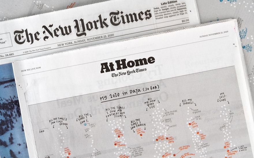
Our lives have been transformed during the Covid-19 pandemic as the activities we used to do every day have been put on hold and new, socially distanced routines have taken their place. Pentagram partner Giorgia Lupi documents these changes in her own life in a data visualization commissioned by The New York Times for the cover of its “At Home” section, which runs as part of the newspaper’s Sunday edition. The hand-drawn visualization is a personal timeline that tracks the “last” time Giorgia did something before the pandemic hit, and the “first” time she did something new as she started to emerge from lockdown.
When conceiving the visualization, the challenge for the designer was finding a way to relate the story of her year on a personal level. She thought about looking back at her reactions to headlines about the mounting crisis, or documenting the frequency of activities during the never-ending lockdown. In the end, she focused on the new landmarks in her life as she followed the restrictions of social distancing and tried to stay safe.
In an artist’s statement, Giorgia writes: “Reading my journal for the year, it struck me how probably all of us can recall the ‘last time’ we took the subway, sat at a bar counter, saw a dear friend. But we all likely have many ‘first times’ on our calendars as well, slowly regaining a sense of freedom and punctuating our mental timelines. I chose to tell this story in personal data.”
The concept echoes “Dear Data,” the project in which Giorgia and her friend Stefanie Posavec collected and shared personal data both to get to know each other and look at the larger trends in their lives. The approach utilizes the principles of “data humanism”—using data to uncover human stories behind the numbers and statistics, and to challenge the idea of data as something that is impersonal and intimidating. The informal collection of data as a personal activity is especially appropriate for the “At Home” section, which suggests things readers can do during lockdown.
To create the Times visualization, Giorgia looked back at various collections of data from her life over the past several months—the calls, meetings and appointments noted in her calendar; the entries in her daily journal and diary; and her text conversations with colleagues and friends. These cover everything from client meetings at Pentagram to subway rides to exercise sessions.
The data has been organized into several different categories, including “All the Times I Saw Close Friends,” “All the Times I Saw Family”—and the last time she saw her mother in Italy—“All the Times I Saw My Partners and Team” (at Pentagram), “All My New York Life,” and “My Self-Care.”
Giorgia wanted to keep the visualization relatively simple and easy to understand, to help encourage readers to think about their own months and days under lockdown and how they might track them. Newspaper printing required a reduced color palette, which helped guide the choices for the graphic elements representing various data points.
In the visualization, individual events are represented with white dots, with the “lasts” marked red ending sometime in March, when the pandemic hit, before the blue “firsts” start up again in the new socially distanced spring. In between the two periods, fields of wavy lines show the blur of “virtual” events and the days running together.
Marks applied to the dots provide a further layer of context and detail. Red dots with black lines represent events that are true lasts, for now—friends who haven’t been seen in person since, or an activity that hasn’t resumed. White lines indicate an activity that has restarted with social distancing, while white asterisks mark the first time doing something that is completely new, like a first BLM protest or first meditation session. Select events are annotated with additional notes for further information.
The white dots are dense before the lockdown begins, then become sparser in the months since. One exception is the start of a new, pre-pandemic relationship—marked with a blue “first” back in January—whose dots happily increase in frequency as the year progresses, showing that human connection can still flourish during quarantine.

