Nestled in the foothills of the Dolomites, the small town of Trento, Italy, is home to MUSE, the new museum of science designed by Renzo Piano. Exhibiting archaeology, geology, geography and cosmology, MUSE is a living museum.
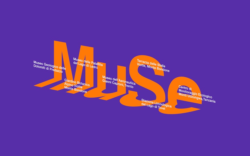
The identity is inspired by a diagram in the book ‘The Keepers of Genesis’ that showed the relationship of the Giza plateau pyramids to the stars. From that diagram, we saw the potential to create a logotype for MUSE that related it at once to the mountains that create the Trento valley in which it sits and its place on earth in Northern Italy. The logotype was therefore able to represent the universal, global and local.
In form, the logo is folded in two to create the metaphor of the mountains and its valley. The MUSE logotype creates its own valley, and is orientated at a particular angle, taken from the building’s apex. Images and typography float in the illusionary valley space.
The logotype, just like the museum, is the presenter of stories. Whether bold, quiet, childlike or mature, the chameleon-like identity can shift to accommodate a diversity of content and audience. The logo’s colour changes to best fit its context. When a logotype is liberated, it is allowed to breathe and change to fit different contexts, making them feel more more relevant and alive.
The identity can be used in two separate ways: close-in and pulled back. When close-in, the logo offers a local view and narrates a specific story. When pulled back, the identity offers a wider perspective including earth and the solar system. Either can be used, depending on the nature of the narrative.
With such a powerful architectural statement at the centre of this project it was hard not to be drawn into making the building the visual representation of MUSE. The idea for the identity had to be so much more, it had to be universal.

