Master logo from the new identity.

Materials featuring the new identity invite visitors to participate in the experience of the museum.
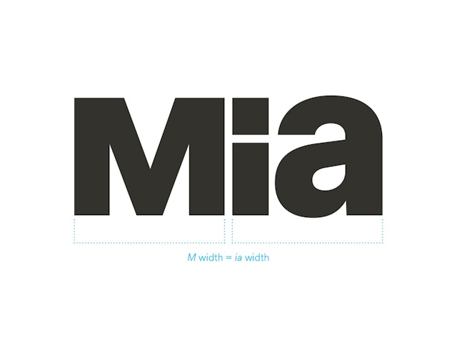
The width of the “M” is equal to the width of the “i” and “a” combined.
The custom typeface, Mia Grotesk, is available in four weights.

The unicase M from the logo is used in headlines and display type.


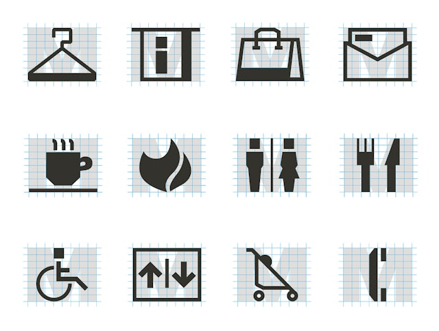
Custom icons are based on the dimensions of the unicase M.


The logo applied to historical signage at Mia’s seasonal entrance.

Banners from the rebranding launch campaign along the street outside the museum.
1 The logo applied to historical signage at Mia’s seasonal entrance. 2 Banners from the rebranding launch campaign along the street outside the museum. 3 Billboard from the rebranding launch campaign that was advertised throughout Minneapolis.

Billboard from the rebranding launch campaign that was advertised throughout Minneapolis.
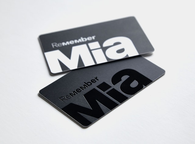
Membership cards.
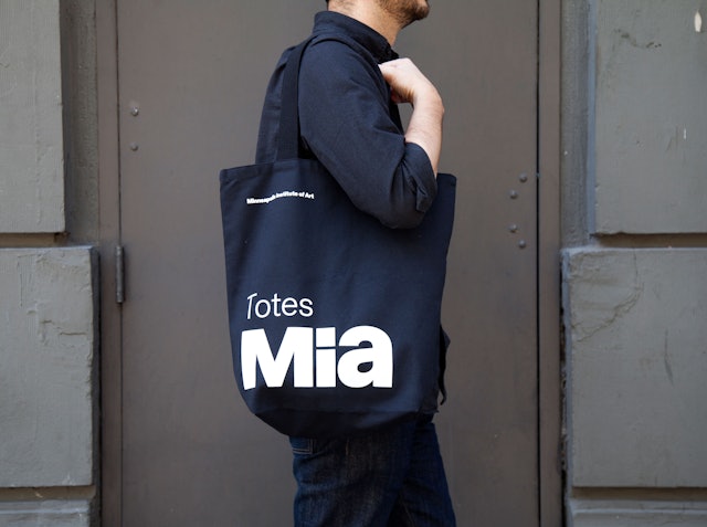
Tote.
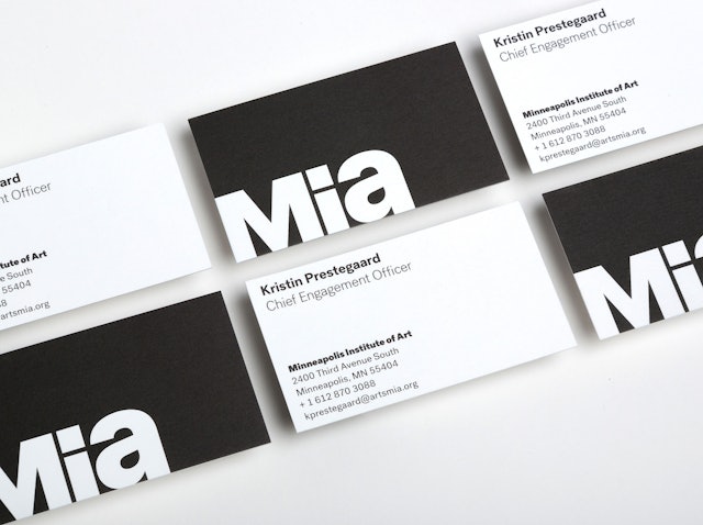
Business cards.
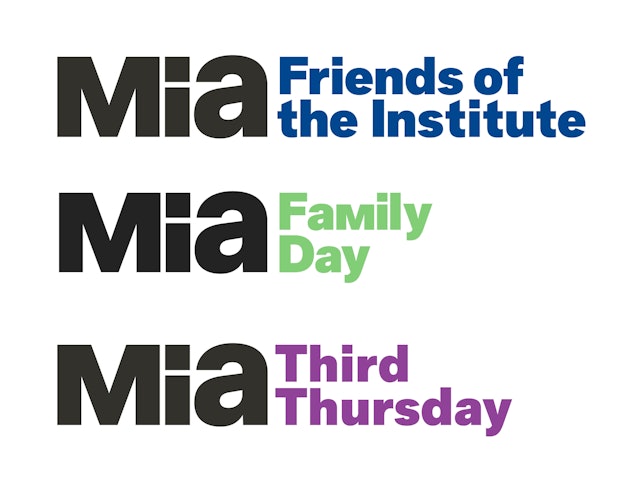
Sub-brands for the various Mia programs are locked up with the logo and keyed to a specific color.
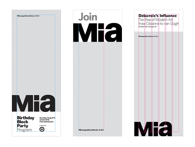
A cohesive grid system was developed for consistent layout of the brand in promotional materials, publications and other collateral.
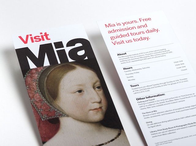
Rack card with visitor information.
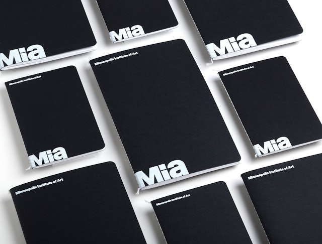
Notebooks available at the Store at Mia.
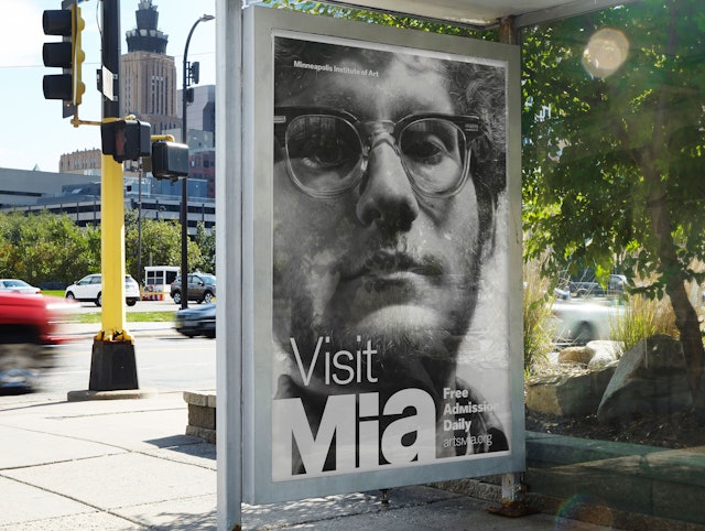
Bus shelter ad from the rebranding launch campaign.