Pentagram have designed the interiors for Margaret Howell’s design studio, the creative heart of the Margaret Howell label. The studio is housed at the rear of the label's Wigmore Street store, the site of the first collaboration between Pentagram and the fashion designer, which has gone on to encompass flagships and concession stores in Britain, France, Italy and Japan.
Margaret’s office has been located in the rear of Wigmore Street since the store was first completed in 2002. However, as the business has grown, so has her creative team, and Margaret approached Pentagram with the task of making the studio larger and creating a serene environment for her and her team to design in.
The first task was to strip out any extraneous details and embrace the space’s original shape and architectural details.
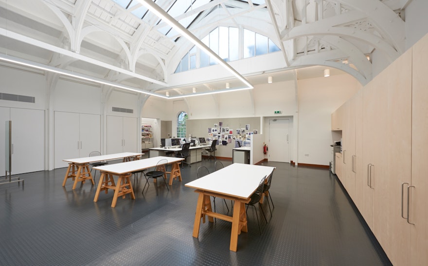
The studio has been redesigned to be open-plan, with three trestle meeting tables occupying the centre of the room. Two long work stations have been placed either side of the meeting area, and the whole space is flooded by daylight from the existing skylight lantern above.
Within the room, Pentagram proposed a long wall of cupboards in birch plywood. This elemental piece of furniture allows the studio to maintain a sense of calm, providing a home for all the samples, buttons, fittings and files essential to the studio’s everyday work. This ample storage allows for the studio to be flexible, creating opportunities for the space to transform between different functions.
A sense of order has also been applied to storage, which is housed in niches off the main volume. Each niche has been given a purpose, be it as a repository for the current collection or kitchenettes in birch plywood. The doors to the niches are all white, disappearing seamlessly into the walls. The staff entrance has also been rationalised to include WC areas, lockers and bicycle storage. The same materiality used for the studio has been brought into the space, through the floors and birch detailing.
The entire studio is painted white with a dark grey studded rubber floor throughout, paired with a tan-coloured skirting. Colours are introduced as linings; the birch plywood continuous wall of cupboards and soft grey pin boards adjacent to work stations. The result is a simple, calm and tranquil backdrop to the design studio.

