What was Manhattan like 400 years ago, before the first settlers arrived? Designed by Pentagram, the new exhibition Mannahatta/Manhattan: A Natural History of New York City at the Museum of the City of New York reconstructs the ecology of the small wooded island originally known as Mannahatta ("island of many hills" as the Lenape Indians called it) before it became one of the most densely built places on earth. The exhibition is presented in collaboration with the Wildlife Conservation Society and is based on the Mannahatta Project, scientist Eric W. Sanderson’s decade-long research of the ecological history of the island, its geological features, as well as its flora and fauna. The exhibition has been mounted as part of the museum’s celebration of the 400th anniversary of the arrival of Henry Hudson in Mannahatta (September 12, 1609).
Pentagram also designed Sanderson’s book about the project, Mannahatta: A Natural History of New York City, and like the book, the exhibition presents stunning visualizations of pre-settlement Manhattan rendered by Markley Boyer. The design of the exhibition highlights these visualizations to transport visitors to a Manhattan quite unlike the one outside the museum walls.
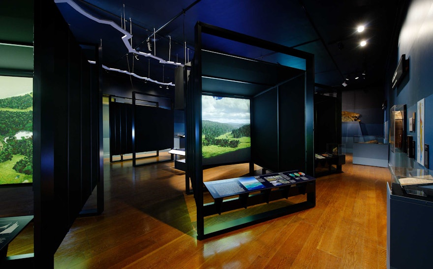
The exhibition presents seven visualizations by Boyer, including several that are not featured in the book. These 6-by-6 foot "digital reconstructions" are shown in structures that evoke the form of a view camera, or a kind of primitive camera obscura. These "cameras" act as transporting devices that allow visitors to “see” into the past. The reference to the camera contextualizes the imagery as the result of a kind of data-based visualization, a hybrid of state-of-the-art cartography and 3-d rendering software; the cameras look both backwards and forwards. The images are backlit with powerful fluorescent lighting and in the cameras the visualizations gain depth they would not have if exhibited on a wall. Each camera is fronted by a display panel that explains the natural features of the location and presents specimens and additional information.
An outline of Manhattan hangs from the gallery’s ceiling, and the visualizations have been placed around this border so that when visitors look through the cameras they seem to be looking at the corresponding location on the island itself. In the center of the gallery, where Central Park would be, is a topographical model of Manhattan with the same proportions as the park. This display presents a projection of changing data in a sequence of four separate themes including the physical fundamentals of the island, its ecological landscapes, historical evolution and Native American cultures.
The exhibition graphics use the vernacular of the subway to pinpoint the modern-day locations that form the basis of the exhibition's case studies. Signage in the gallery is placed near each camera to give the sense of a time machine making different “stops” around the island. The walls of the gallery have been treated with a dark to light gradation that suggests both topography and a darkened forest, with bands corresponding to the different levels of the island's tree canopy, understory and scrub. Displays around the gallery’s periphery include specimens of Mannahatta's nature, topological maps and an interactive display of a Muir web, a diagram of the interconnectedness of the island’s original ecology.

