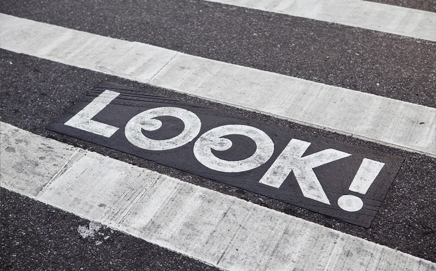
When it comes to traffic safety one of the most powerful tools we have is our eyes. Working with the New York City Department of Transportation, Pentagram has designed a playful new symbol and campaign that reminds pedestrians and drivers to look before entering crosswalks and intersections.
In a busy city like New York, it’s often not easy to know which way to look. Inspired by the "look right, look left" signage on the streets of London and other cities, the new symbol consists of a single simple word––“LOOK!” The graphic turns the “O”s of the word into a pair of eyes, with the pupils positioned to the left or right to let pedestrians know exactly which way to look. New Yorkers are accustomed to glancing down as they walk, and on the pavement the graphic becomes a quick and intuitive cue, easily understood by pedestrians of all ages and languages. The signage is currently being applied to intersections throughout the city.
“LOOK!” is being introduced with a marketing campaign written and designed by Pentagram that pairs the mark with the eyes of New Yorkers (including several members of our office and the NYC Department of Transportation). The campaign will appear on buses, bus shelters and phone kiosks around the city.

