For the eighth year running, Pentagram has designed the visual identity and promotional materials for London Design Festival, one of the biggest events in the design world. Running from 13th-21st September across London with the V&A as its centre, the Festival includes exhibitions, talks and workshops about a range of design disciplines.
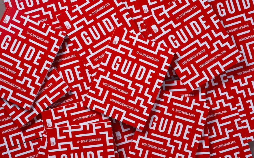
London is a huge and unplanned city where even the most experienced visitors can lose their way. This year Pentagram is honouring London’s chaotic nature by challenging visitors to “Lose yourself in the London Design Festival”.
This sentiment inspired the maze graphic. As with Pentagram’s other London Design Festival identities, red and white are the only colours used. Red is particularly important because of its connection with London’s visual architecture, from double decker buses to telephone boxes to the Underground’s Central Line.
The maze graphic is a distinct break from the typographic London Design Festival identities of previous years. It invites visitors to explore the festival without an agenda and stumble upon events that they may not have attended otherwise.

