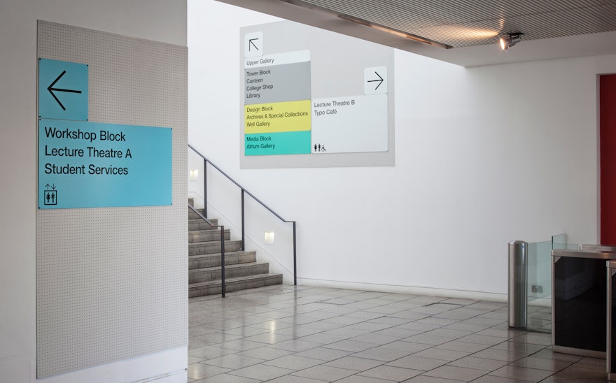
Pentagram has developed a wayfinding solution for the London College of Communication. LCC is one of the UK’s most well-known and influential design colleges with alumni including: Neville Brody and Jefferson Hack. Now part of the University of the Arts London, it has been at its Elephant & Castle location since 1962.
Following their redesign of the UAL identity, Pentagram was asked by LCC’s Head of College, Natalie Brett, to look at a new wayfinding solution for their current site (the college plans to re-locate to a new purpose built site). Its existing signage was a mixture of the previous environmental graphics scheme - which had fallen into disrepair - and A4 photocopies.
LCC began as the London College of Printing; it changed its name to signify its growing remit that now includes photography, film and public relations. Because of its increasing offerings, one of the biggest challenges was the ad hoc way that the current site had been developed.
The college and its buildings have developed so rapidly in recent years that the main challenge of the project was to find a solution that could work within LCC’s four different buildings and be adaptable enough to allow the college to change room names and redecorate when necessary. It also had to be cost-effective because of the college’s upcoming move.
With this in mind the Pentagram team needed to establish a first-hand understanding of the unique functions of each building and where information was most needed. The team spent a lot of time walking between the different rooms in the different buildings to understand how the room types were used.
The resulting wayfinding solution is extremely adaptable, simple and functional. The material palette is inspired by one of LCC’s key principles – a dedication to “making” and physical design.
The signage can be fixed onto any wall type without the need for a massive redecoration programme. It uses a consistent background plate, made from perforated powder-coated aluminum, which helps visitors identify signage. These become a platform for room types and directional signs to be screwed on top of. Colour coding has also been introduced to signify the college’s four main areas. Small naming alterations have been introduced to further simplify the system. Helvetica has been used to create a consistency between the College and UAL’s overall identity.
Photography by Max Creasy.

