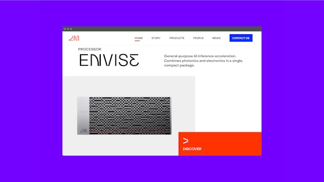
The branding positions photonics as the new computing paradigm and Lightmatter as the company ready to take the world into the future.


The Lightmatter brand exemplifies the company’s revolutionary technology through an approachable, almost playful visual and verbal identity.


Lightmatter’s tech is complex and significant, but the retro-futuristic aesthetic helps make brand expressions appropriately light-hearted, uplifting and engaging.


The approachable and engaging identity is reflected in the industrial design of the hardware.


Lightmatter is a pioneer in the design and development of photonic computing—processors that use light and advanced optics to run faster and more efficiently than anything else on earth. The company’s revolutionary hardware and software is purpose-built to power the next generation of artificial intelligence applications across industries.
Photonic computing, sometimes referred to optical computing, uses light instead of electrons to calculate and transfer data, leading to a reduction in energy consumption per chip and dramatic improvements in processor speed. True to its name, Lightmatter is combining the unique properties of light as a data carrier with the interoperability of electronics to create technologies that will take us past the limitations and environmental challenges of traditional transistors.
Pentagram has developed the brand positioning, product naming, visual identity, product design and digital design for Lightmatter that positions photonics as the new computing paradigm and Lightmatter as the company ready to take the world into the future. The messaging and brand voice help make the complex technology user-friendly, and the branding features a distinctive custom typeface inspired by AI. The identity is reflected in the industrial design of the hardware.
The Pentagram team collaborated closely on the project with the founders of Lightmatter. The company was founded with the mission of accelerating computing advancements that address humanity’s biggest challenges while reducing the environmental impact on the planet. Photonic, or optical, computers have long been the ultimate goal for information processing, given their potential for high bandwidth and low power computation. Lightmatter was the first to successfully combine photonics and electronics into an entirely new optical (super)computer, delivering on the promise of highly power-efficient, parallel computation with light.
Improvements in computers are driving innovation, and the goal of the brand strategy is to position Lightmatter as the best optical computing company in the world, enabling the next giant leaps in human progress. Lightmatter is uniquely qualified for this moment, with a specialized team that has been responsible for much of the groundbreaking research and development in the field. The branding depicts the technology coming out of Lightmatter as a computing milestone-––one that serves a much higher purpose than simply accelerating AI.
“It’s time for something (r)evolutionary.” This is the prevailing ethos behind Lightmatter, and the impetus behind the brand’s look and feel. A balance between futurism and humanism, next-generation advancements and present-day solutions, the Lightmatter brand exemplifies the company’s revolutionary technology through an approachable, almost playful visual and verbal identity, creating an iconic presence that will continue to make itself felt decades after this (r)evolutionary optical supercomputing is entirely familiar.
The visual identity is built around a custom typeface called Inference Sans, a geometric sans serif with built-in alternate versions of some of its characters. The typeface is utilized in the Lightmatter wordmark, and the letters “L” and “M” are combined to create a distinctive monogram.
The name of the typeface is a nod to the AI inference accelerator developed by Lightmatter that utilizes light to compute and transport data. An inference engine is the component of a computing system that applies logical rules (typically represented as “IF-THEN”) to deduce new information. In the typeface, geometric forms and glyphs take the place of letters, suggesting possible options and outcomes. (Some letters only have one alternate, while others have two, with a left and right slant.) In animations, the alternates cycle through the typography, like a computer processing.
The alternate letters remain readable as they are interchanged with the original letters, reinforcing the idea of how our minds make inferences and connections, and more abstractly, that the unknown can be realized. Visually, the varying letters also evoke the fusion of light and electronics, particularly in the three-dimensional rendered version of the logo.
In addition to the logo, Inference Sans is used for display typography. Secondary type is set in Object Sans, a utilitarian geometric font (designed by Alex Slobzheninov and available from Pangram Pangram Foundry).
Lightmatter’s tech is complex and significant, but the exuberant retro-futuristic aesthetic helps make brand expressions like the website and promotional materials appropriately light-hearted, uplifting and engaging, with opportunities to go deeper and learn more in the product specifications and on the company’s blog. The designers created guidelines for the custom system of data visualizations including charts, diagrams and other infographics.that are used to describe and quantify the technology.
The bright color palette features red and white as the primary colors, with black for contrast, while a range of secondary and tertiary colors are used in data visualizations and in representations of the code for its software stack, Idiom. A series of custom icons rendered in the pixelated style of 8-bit graphics are used in promotional swag like totes and stickers. The branding also makes selective use of photography and motion to convey a sense of wonder about the technology and the idea of movement through light.
Office
- New York
Partner
Project team
- AJ Kim
- Hansol Jang
- Xinle Huang
- Eline Mul
- John Sampson
- Ran Zheng
- Veronica Hoglund
Collaborators
- Kyle Barron-Cohen
- Eva Green
- Tipo Type, typeface development
