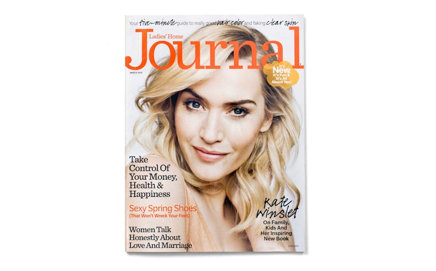
Pentagram was hired to redesign Ladies’ Home Journal to help make it more open, engaging and personal—more like a "journal." One of the country’s top ten magazines in paid circulation, Ladies’ Home Journal has a circulation of 3.2 million and a readership of over 12 million. Founded in 1883, the magazine is one of the “Seven Sisters” and in 1907 became the first American magazine to reach 1 million subscribers. Now published by Meredith, it has remained a fixture in American women’s lives. The redesign by Pentagram updates the magazine’s format to make it accessible, contemporary and relevant to today’s audiences, establishing a tone of intimacy that complements the new editorial strategy.
The designers worked closely with LHJ editor-in-chief Sally Lee and creative director Jeffrey Saks on the project. Prior to the redesign, the magazine planned a rebranding that would transition the title from a lifestyle magazine to a more personal format inspired by the rising popularity of journaling, blogs and social media like Twitter and Facebook. Ladies’ Home Journal has always been a pioneer in focusing on personal growth and fulfillment in women’s lives, and the editors wanted to actively engage their readers and make the magazine a platform for conversation and a forum where women could better share their own experiences.
To help create this collective experience and sense of community, LHJ has partnered with Divine Caroline, a website also published by Meredith where women write about their own lives. A portion of LHJ content will be inspired by or reprint posts from the site, and the magazine will incorporate socially generated content throughout its pages. For instance, new features include a recurring “Reader Feed” that shares comments from readers; a “Snapshot” page that publishes photos submitted by readers; and a back page feature called “Back Story” that tells the story behind a reader’s personal photograph. The new Ladies’ Home Journal will literally become a woman’s own journal: readers will co-create the content, shared via social media.
Pentagram’s redesign helps make this transition seem like a natural expansion of the magazine’s editorial mission. The engaging new cover design sets the tone. Prior to the redesign, the covers appeared demure and traditional; since 2003, the masthead emphasized the words “Home Journal.” The redesign returns the focus to “Journal,” an approach that had been used throughout much of the magazine’s history.
A mix of fonts helps establish a feeling of writerly intimacy. The masthead is set in Sentinel, a friendly slab serif font. Also contributing to the journal-like feel is LHJ Saga, a customized handwriting font. The Plan Grotesque family is used for body copy and headlines.
Over its long history, LHJ’s covers have featured the work of legendary artists and photographers from John Singer Sargent and Norman Rockwell to Edward Steichen and Man Ray. For the redesign, the magazine has a contract with the noted photographer Brigitte Lacombe, known for creating portraits that have an authentic warmth and honesty. For the first issue Lacome has created a radiant portrait of the actress Kate Winslet. The photography style throughout the redesigned magazine is less contrived and more sophisticated, spontaneous and naturalistic.
Inside the magazine, the designers helped reorganize departments and create better navigation. The retooled magazine has more reading, and the active, open grid easily balances longer articles and essays with charts, sidebars and marginalia that incorporate reader comments and provide visual texture. Front-of-book sections include “Notes,” “Share,” and “Shine”; a back-of-book section called “Strong” focuses on health. Headers for the sections use handwritten type, and single editorial pages have been separated from adjacent advertising with a double vertical rule that extends down the side of the page, suggesting a notebook or journal. Throughout the magazine, web touts the editors call “clouds” indicate points where readers can interact or find more information on the web.
Pentagram previously redesigned Better Homes and Gardens, also published by Meredith.

