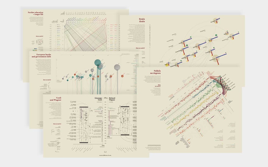
La Lettura is the Sunday cultural supplement to Corriere della Sera, Italy’s leading newspaper. Every week, the section features a curated collection of long-form articles by contemporary intellectuals about culture, society, and new media. The editor invited Pentagram partner Giorgia Lupi, then with Accurat, to create a series of experimental data visualizations for La Lettura. Her designs enticed readers to ponder at leisure the fascinating patterns and details driven by data on subjects as diverse as “brain drain” rates in 16 countries, the auction versus sale prices of significant works of art, and the relationship between various kinds of Nobel Prizes and academic credentials.
Working side-by-side, Lupi’s team and the newsroom staff considered a range of topics they believed worthy of exploration. Whether current affairs or historical issues, their choice for each week might come from a compelling dataset, a hot topic or current event, or a personal fascination or intuition. They would then analyze and compare different kinds of datasets associated with the chosen topic that might reveal a strong story—ideally an unexpected one.
Once the project team had found a story, they would build context around it by researching related facts and ideas that would add dimension. In addition to quantitative data, the team would seek qualitative information, looking for the supporting material that would help transform raw statistics into new knowledge. Weaving these narrative threads together typically yielded the unexpected parallels, uncommon correlations, and subtle insights that enriched the main story.
The final phase of the creative process was to design an attractive visualization of the findings. In the full-spread format of the Sunday paper, compelling aesthetics would serve to catch the reader’s attention while a clear presentation and rich details would hold it. The designers used the full complement of graphic standards—taking inspiration from sources as varied as maps and musical scores—and integrated original symbols and notations to build out the diagrams. Lupi and her team delivered lavish visual narratives that retained the complexity of the data while making it accessible and understandable.
The series broke with convention in the newspaper-editorial field by conveying and celebrating the richness of data stories instead of merely simplifying them. Data Visuals have been shared widely by publications such as Fast Company, The Atlantic, and Popular Science, in addition to garnering numerous awards: the O’Reilly Strata Award for Data Journalism, the Gold Medal for Data Visualization at the Kantar Information is Beautiful Awards, the Bronze Medal for News Portfolio at the SND Malofiej Awards, and a special mention by the Core77 Design Awards for communication.

