The new name, identity and visual system that pay respect to the organization’s long history while looking forward to build a more diverse audience for its programming.

Expressive typography and an apostrophe brand mark nod to the institution’s engaging approach to language.


L’Alliance New York is the home for all things French in NYC and beyond. Offering immersive French language classes and a wide range of multi-disciplinary programming, the independent non-profit organization celebrates the diversity of francophone cultures and creativity around the world.
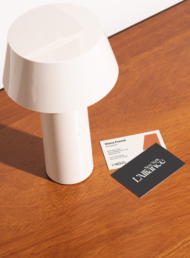
Pentagram has designed a new brand identity framework for L’Alliance that highlights its dynamic and welcoming spirit. Expressive typography and an apostrophe brand mark nod to the institution’s engaging approach to language. The new look accompanies a new name for the organization, which was previously known as the French Institute Alliance Française, or FIAF.
The rebrand follows the 125th anniversary of L’Alliance New York in 2023. The group’s roots date to 1898, when the Alliance Française de New York was founded as one of the earliest chapters of the Alliance Française network. (There are now over 800 around the world.) In 1971, the organization merged with the Museum of French Art, French Institute to become FIAF (French Institute Alliance Française).
Housed in a historic Beaux-Arts building on Manhattan’s Upper East Side, L’Alliance functions as a cultural hub for New York’s francophone community. Over the past 125 years, it has taught French to hundreds of thousands of students of all ages in New York City and online. Its programming includes art exhibitions in its gallery, francophone cinema and theater in Florence Gould Hall, and lectures and talks by leaders from the worlds of art, culture, philosophy, literature, and business.
“As we look back at all we’ve accomplished, the future looks even brighter,” says L’Alliance New York President Tatyana Franck. “Our new name and visual identity symbolize our dedication to innovation, growth, and inclusivity, enabling us to better connect with our community."
The challenge for Pentagram was collaborating with the organization on a new name, identity and visual system that paid respect to its long history while looking forward to broadening its audience. L’Alliance was founded with the mission of promoting French culture and French language. A driving force of the update was to think about this more expansively, and to represent all French-speaking people and all French-speaking countries across the diaspora. The French language is on track to be the second most-spoken language in the world by 2050, with the majority of the growth coming from African countries.
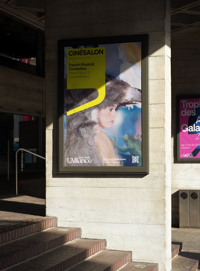
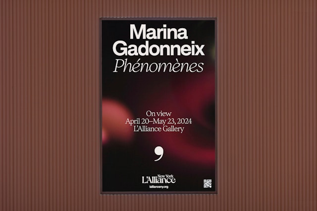
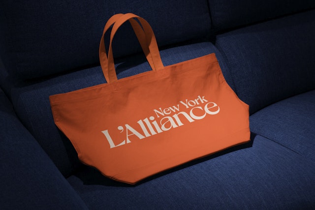
For the rebrand, this meant not leaning too heavily into the stereotypical blue, white and red of the French tricolor flag and other symbols and imagery associated with the country. Instead, the identity uses a vibrant and inspirational visual language to speak to many different types of people and reach a more diverse visitorship, including New Yorkers who may not previously have identified with FIAF. The bold typography and bright, contemporary color stand out in the city’s crowded landscape of cultural institutions, including from other French-aligned organizations with similar audiences and programming.
The new name embodies this inclusivity. “Alliance” has the same meaning in French and English—a joining together or building of connections. The name suggests a place or sense of community found among the organization’s members, students, and guests. From a broader perspective, it evokes the alliance of all francophone nations and French-speaking people around the world, as well as the global network of Alliances Françaises. It also nods to the alliance between language and culture, which inform each other. This unifying spirit is captured in the new tagline, “Your French Rendez-Vous.”
This humanism is reflected in the new wordmark, which finds a balance between classic and contemporary, eccentricity and elegance, past and present. Simultaneously bold and intricate, the logotype is a modern take on an Art Nouveau inspired typeface that calls back to the lettering on a Paris Métro sign. The logo can incorporate endorsers for New York and sub-brands such as the Montclair location and Online and Preschool programs. The “All” in “Alliance” can be highlighted in another color to further emphasize the idea of community.
Brand typography was intentionally sourced from French type foundries. The wordmark is heavily customized from Dahlia, an idiosyncratic serif with dramatic curves and high contrast (from VJ Type).The duo of primary brand typefaces juxtaposes the elegant serif Inferi with the neo-grotesque sans Rules (both from Blaze Type).
The apostrophe in the name and logo doubles as a flexible brand mark and foundational graphic element that signifies L’Alliance as a school for language. Extensively used in French, this tiny bit of punctuation grammatically holds great power, bringing together the name and article, or acting as a possessive, a building block of belonging.
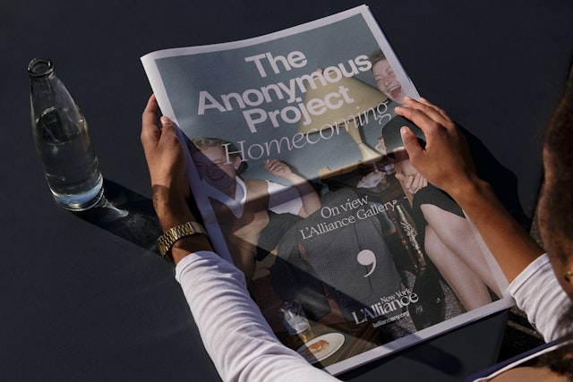
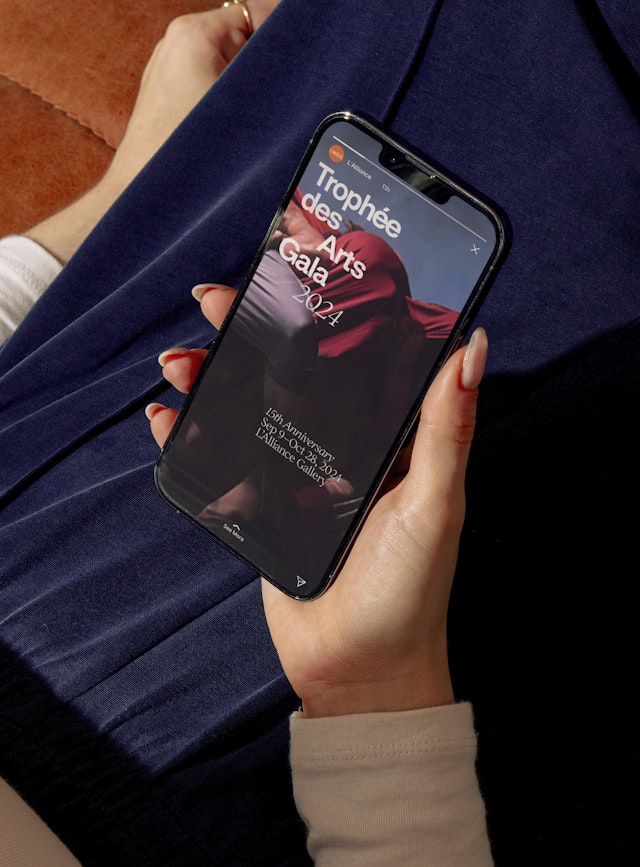
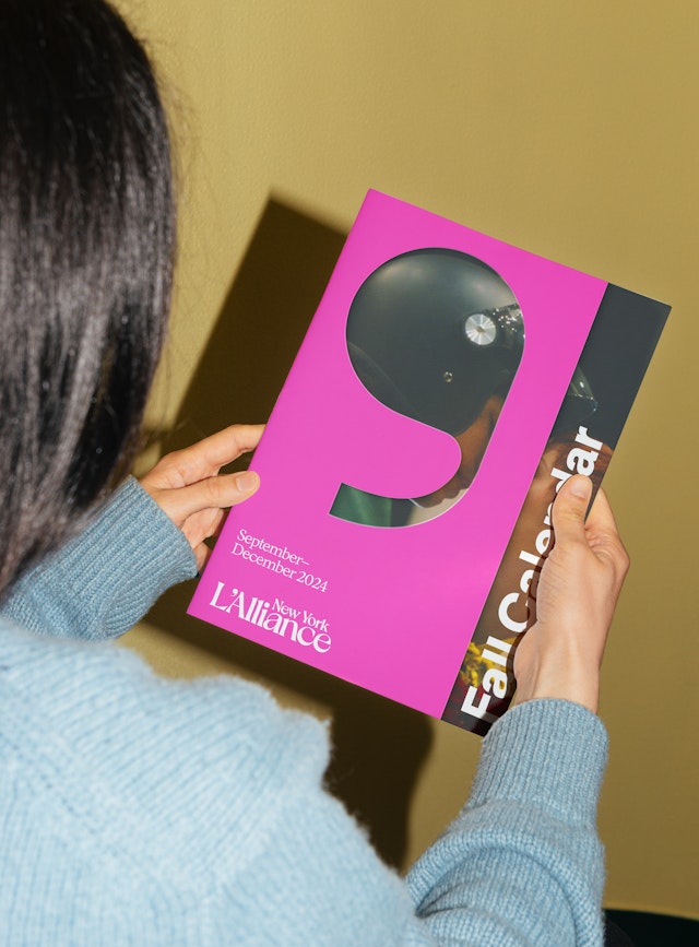
The system uses different styles and colors of apostrophes to represent the various programs and departments of L’Alliance—French Classes, Preschool, Performing Arts, Gallery, Library, Cinema and so on—creating a sub-brand for each. A library of 81 different variations was developed, with the head and tail shape dictating which category the apostrophe belongs to. The mark can also function as a container for imagery or type.
The kit of parts allows for an enormous amount of variety and flexibility across applications like posters, newsletters, social media and promotional campaigns. Each apostrophe is instantly recognizable as a mark of L’Alliance; cumulatively they speak to the diversity, community and fraternite the organization provides.
Office
- New York
Partner
Project team
- Jack Collins
- Ruben Gijselhart
- Nick Tallent
- Ruairi Walsh
- Cristina Giménez
- Dana Reginiano
Collaborators
- Fabian Tejada, animation
