Pentagram refreshed the visual identity and digital experience for an online gallery and art fulfilment house in order to appeal to more high-value customers.
Since 1982, King & McGaw has printed art for some of the world’s most renowned artists, museum and galleries. The company also licences, prints and sells a range of artworks online, from rare and limited editions to popular and vintage prints. In a bid to distinguish itself from the competitive home décor art market, King & McGaw created a new retail strategy that focuses more on its premium products.
The company’s goal is to target serious art lovers willing to pay more for quality production and framing, while also creating a better brand alignment with their client work for museums and galleries. Pentagram’s challenge was to shift the emphasis of King & McGaw’s online shop towards the Rare and Limited catalogue without impacting sales from other product lines.
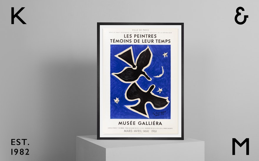
The solution was a new streamlined user experience that makes it easier for customers to discover inspiring art and a two-tier approach to art direction that gives extra prominence to higher-value prints. Premium artworks are displayed in a gallery-style setting, while open prints continue to be shown in a domestic environment but with the old cluttered and lived-in look replaced by a new minimal, aspirational style.
The old site’s functionality and content was too focused on King & McGaw’s framing service. Pentagram’s redesigned product pages draw more attention to the artwork and surface additional content that was previously hard to find. The site is now fully optimised for mobile as a lot of audience traffic comes from mobile-first social media sites like Instagram.
Pentagram made a number of significant updates to the King & McGaw logotype that reflect the new premium strategy. The letters are now more contemporary and characterful, while the ampersand was completely redrawn in a distinguished style that references the company’s heritage. Finally, an underscore was added to the lower-case C to give the logotype a unique hand-crafted feel.
The new ampersand and K and M initials form a flexible monogram that can be applied in a variety of formats, from a social media icon to the premium packaging material used when fulfilling customer orders. Pentagram also suggested adding the “EST. 1982” element to the logotype and monogram as another nod to King and McGaw’s heritage that would appeal to a high-value target audience.
King & McGaw’s new brand identity and online gallery launched in May 2019.

