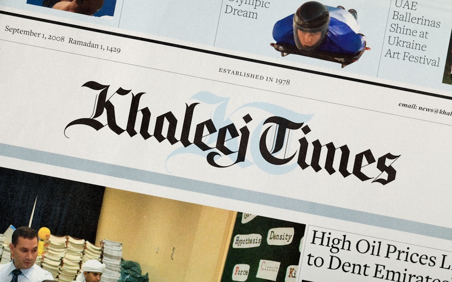
Pentagram has redesigned the Khaleej Times, the Persian Gulf’s leading English language newspaper. The redesign retains the paper’s traditional broadsheet format, while being deliberately modern in its use of color, photography, layout and typography.
Published in Dubai, the paper was launched in 1978 as the UAE’s first English daily and has a readership of 450,000 dispersed throughout the UAE, Bahrain, Oman, Kuwait, Qatar and Saudi Arabia. Although the redesign touches on every element of every page, the paper's heritage has been retained, notably by the choice of a serif headline font and the decision to keep the logo that has been redrawn to be more contemporary.
Much attention was given to increasing the functionality of the typography, making it larger and more readable, and towards that end, a clear, space-efficient serif font, Freight by Joshua Darden, was selected. Freight’s large range of weights enabled this single font family to be used for 90% of the newspaper, both for text and display purposes. The only other typeface used, in the Business section, is Retina, a specially designed font that significantly increases the readability of agate (very small type sizes) without taking up more space. Designed by the renowned New York foundry Hoefler & Frere-Jones, Retina was initially developed for The Wall Street Journal.
The paper consists of several sections including the main section, Business, Sport, Classified, City Times and supplements. Readability has been enhanced by changing the narrow eight-column grid with a profusion of line breaks and hyphens to a six-column grid. A table of contents has been added on page three and a band of short stories now appear across the top of most of the newspaper to give readers access to content on the part of the page that's easiest to scan. Careful use of white space, notably around the headlines, allows the eye to navigate the stories quickly. Pull quotes, sidebars and factoids are used as entry points to make the paper more accessible.
Photography plays an increased role in the paper's communication of the news and images are now more closely cropped, to create dynamic pages.
The City Times section has been redesigned to be fun and engaging as it covers everything from Hollywood to Bollywood. The section has an exciting, brash tabloid sensibility, yet remains visually connected to its parent through its modern typography, layout and font choices. The bold use of graphic black bars helps to unify the disparate images collected on the pages and an occasional use of bright yellow adds energy.
Again functional and technical issues have been addressed in detail: the Television listings have been simplified allowing readers to browse channels during a single time period and wherever possible fonts have been enlarged to help busy readers.

