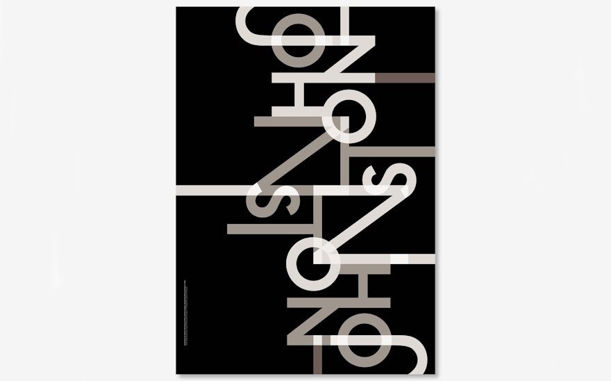
In 1916, Edward Johnston designed Johnston, the now iconic typeface used throughout the London Underground network. It's introduction was a key part of the unification of The Underground Group, which until then had used a disparate set of signs and fonts. In honour of Johnston’s centenary, Transport for London has commissioned a series of posters by 11 prominent design studios to celebrate the typeface.
Pentagram’s contribution to the series uses the typeface's characters to create a composition that is abstract but also typographic.
The poster, made up of a network of lines that interlink and channel into each other, represents the complexity of the Underground network that Johnston seamlessly helps travellers to navigate. A monochromatic colour palette is used, its black and muted tones emphasising the letterforms themselves.
The poster can be spotted on the London Underground. It is on sale at TfL’s Johnston pop-shop at Clerkenwell Design Week and the London Transport Museum. It will be exhibited at KK Outlet from 16-28 May as part of the Language of London show.

