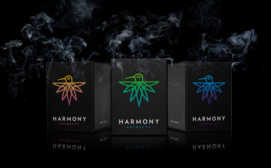
Harmony Extracts is a cannabis concentrate company that uses state-of-the-art extraction technologies to transform marijuana plants into high-quality, potent concentrates. A new enterprise based in Denver, Colorado, one of the nearly 30 states where marijuana is now legal, Harmony commissioned Pentagram to design its brand identity and packaging for the company’s initial line of products.
The Pentagram partners have worked on the fringes of the cannabis industry for years. In 2009 Pentagram began a long association with Advanced Nutrients. A leading hydroponics company based in Vancouver, Advanced Nutrients manufactures and distributes super-fertilizers and growth-enhancement products for growing plants in water instead of soil, and indoors away from the sun–and the prying eyes of the authorities. Over the years, Pentagram’s designers have designed over fifty product labels for Advanced Nutrients with evocative names like Big Bud, Kushie Kush, Wet Betty, Voodoo Juice, Tarantula, and Bud Candy. Pentagram also designed and named the world’s first “hydroponics lifestyle” magazine for the company. The slick, high-end publication called Rosebud ran stories on hydroponic gardening, popular culture and the jet-set lifestyles of the cannabis crowd.
The explosive cannabis category has become a bit of a cottage industry for Pentagram ever since the firm designed the brand identity, packaging and website for Leafs by Snoop, rap icon Snoop Dogg’s line of medical and recreational marijuana-based products in 2015. Snoop’s offerings included both flower and edibles (“Dogg Treats”) such as chocolate bars, chews, drops and gummies. Working at the forefront of the legalization movement the Pentagram team created a stylish gold logo and pristine white packaging for the brand that turned heads because of its fresh, stereotype-busting entry into a retail environment that had existed underground until the legalization of marijuana began to gain momentum across the country.
Since then the partners have been involved in a variety of cannabis-related design projects and Pentagram’s early success in the burgeoning category helped to open the door for the company’s engagement with Harmony Extracts.
During the preliminary research phase of the Harmony Extracts initiative the designers traveled to Denver for a kickoff meeting and tour of a half-dozen marijuana dispensaries. Now that marijuana is legal in Denver new retail outlets have sprung up all over the city. Half of the dispensaries observed by the Pentagram team looked like the typical “head-shops” of days gone by–small, dimly lit dens crammed full of amateur, overly colorful packaging that would fit comfortably in High-Times magazine. But a few of the dispensaries the designers visited were modern, clean and well-considered spaces that seemed to be on a mission to become the Starbucks of the cannabis retail world. The Pentagram team came away from the tour with a resolve to position Harmony Extracts visually as a modern, high-end brand in order to establish its niche in the rapidly evolving cannabis retail environment.
Harmony’s concentrates are made by extracting THC and other cannabinoids from the flower of a marijuana plant. The street term for concentrates is “dabs,” because the consumer dabs the waxy extract onto a hot surface in order to inhale its vapors through the dab rig. Dab is the umbrella term for the different forms of cannabis concentrates including shatters, waxes, budders, sugars, and distillates.
Early in their brand identity explorations, the design team landed on the idea of using an image of a hummingbird, with distinctive marijuana-leaf shaped tail feathers, as the symbol for Harmony and its line of extracts. A hummingbird, “nature’s little extractor,” is an energetic, participant in the natural ecosystem and seemed to be the perfect symbol for the new company. The resulting “Harmony Hummingbird” icon was paired up with the typeface Verlag to complete the main identity lockup for the brand.
For the launch of the new line of products Pentagram designed a set of three boxes for shatters, waxes, budders and sugars that come in small, branded glass jars, and another set of slider boxes for Harmony’s distillates which are ultimately consumed with vape pens.
The designers organized Harmony’s products into three main strains of cannabis: “sativa,” “indica,” and “hybrid.” Sativas generally provide a more active high compatible with physical activity, social situations and creative endeavors. Indicas usually generate a more relaxed and physically sedating high and hybrids fall anywhere in between, depending on their parent strains. Each of the three strains was assigned a color indicator based on their mood generating profile. A warm, energetic magenta/orange hummingbird logo is used in the packaging scheme to indicate the sativa strain and a cooler blue/purple range for indica. A yellow/green bird represents the hybrid strain and is used as the main color for the Harmony Extracts brand.
The different colored hummingbirds are positioned against a black packaging scheme printed with matte ink and finished with a “soft-touch” coating. The interiors of the boxes and other containers pick up the color ranges of the three strains.
Package design in a new era of recreational cannabis products was challenging. Like alcohol or cigarettes, laws governing the packaging of marijuana are strict and quickly evolving. The design team used existing, legally approved packaging structures but added a few innovations that satisfied regulatory requirements. Harmony takes its responsibility regarding usage and safety seriously. The company’s products are clearly meant for responsible adults. The minimalism of the designs Pentagram created stylishly satisfies the stringent laws inherent with the packaging of controlled substances.
The national trend toward the legalization of marijuana and the quickly growing retail environment that movement is leaving in its wake has become a prime space for graphic designers to make their mark. Like Snoop Dogg, other well known “celebrity cannabis” brands including Marley Natural (Bob Marley) and Willie’s Reserve (Willie Nelson) have recently entered the market.
Pentagram is also designing the brand identity and packaging of a new line of marijuana products for the founders of the iconic Woodstock music festival in 1969 called “The Woodstock Cannabis Company.” Rock on!

