GSA’s industry-leading systems are driven by scientific generative methods, and it prides itself on its collaborative and supportive work culture and friendly atmosphere.
Crafted from impossible geometry, the symbol merges mathematics and finance, representing the limitless possibilities GSA’s teams navigate in the complex financial landscape.


The tone of voice is factual but characterful and is designed to connect with the smart and thoughtful mathematicians and technologists who form the GSA family.

Founded in 2005 with headquarters in London and New York, GSA Capital (GSA) is a British quantitative finance firm specialising in systematic trading across global equity, futures, and foreign exchange markets. As an independent firm in control of its own destiny, GSA operates with a bold, pioneering mindset. Its industry-leading systems are driven by scientific methods, and it prides itself on its collaborative and supportive work culture and friendly atmosphere.
To distinguish itself from more corporate competitors and attract top quantitative research and technology talent, GSA asked Pentagram to help bring its existing logo to life, by creating a motion interpretation of the same existing möbius strip and a charismatic new visual identity that would attract candidates less familiar with the firm, while retaining an element of mystique.
The concept of the Möbius strip was always the firm’s main signifier. Named after German mathematician August Ferdinand Möbius, it’s a one-sided surface formed by twisting and joining a strip of paper, symbolising GSA’s continuous, generative worldview. The Möbius strip motif symbolises the infinite self-generative quality of the business and becomes the environment that the brand lives in. It appears throughout GSA’s communications and embodies the firm’s unique perspective and ethos.
At the heart of the new brand is GSA logo, which comprises a wordmark and a symbol. The infinite circle symbol is a fusion of sensibility and mathematical intrigue that captures GSA’s essence. Crafted from impossible geometry, the symbol merges mathematics and finance, representing the limitless possibilities GSA’s teams navigate in the complex financial landscape. It reflects its dedication to pushing boundaries, defying limits, and pursuing innovative solutions to complex problems. The GSA wordmark is based on its new brand typeface, Neue Machina Plain, which reinforces the modern, straightforward brand voice.
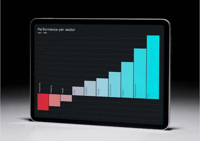
Pentagram developed a custom color palette, featuring Coral and Aqua on the logo’s Möbius Strip as key highlight tones. These colours support an information hierarchy, where Coral denotes losses, errors, or cancellations, and Aqua indicates profits or positive actions.
PP Neue Machina Plain, the primary typeface by Pangram Pangram Foundry, is a versatile, monospace-inspired font. Perfectly suited for the future of technology, it has monospace/geometric type features and is inspired by the aesthetics of data and code. Space Mono, derived from Space Grotesk, supports data and numeral displays.
The tone of voice is factual but characterful and is designed to connect with the smart and thoughtful mathematicians and technologists who form the GSA family. A manifesto and set of team principles were created to help shape communications going forward.
Through its work, GSA sets out to challenge old-fashioned conventional ways and become one of the longest-living high-performing quant trading firms. Pentagram’s new identity will help it attract the brightest minds, and foster a culture of rigorous decision-making, responsibility, and trust.
Office
- London
Partner
Project team
- Marina Willer
- Hamlet Auyeung
- Cleber de Campos
- Natalia Witwicka
- Rita Desport
- Kate Blewett
Collaborators
- John Grant (strategy)
- Two&tall (3D and motion)
