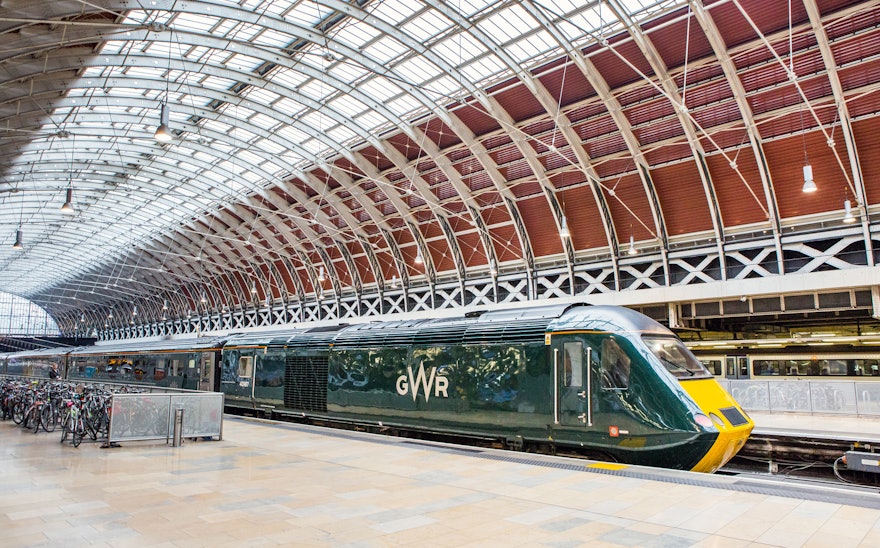
Pentagram has developed a new identity for Great Western Railway. Established in 1833, GWR forever changed Britain's commerce and leisure landscape by connecting London to the West Country and Wales.
GWR's construction was led by 29-year old Isambard Kingdom Brunel and was heralded as a masterpiece of railway design. By the 20th century it had become a rail network of unprecedented size and scale, commonly known as ‘God’s Wonderful Railway’ and the ‘Holiday Line’ which connected urbanites to resorts in Devon and Cornwall.
However, when the railways were nationalised, the GWR name was discontinued, and it became the western region of British Railways. When the railways were re-privatised in the 1990s, the First Group won the franchise, renaming it First Great Western.
Over a hundred years since its creation, Network Rail and the First Group are implementing a £7.5 billion investment programme into the service, which includes the electrification of tracks, the modernisation of stations and the introduction of three million additional seats per year. The new identity is part of this programme and signifies a new brand strategy for the First Group. It reinstates the railway’s original name and introduces the brand across trains, stations, digital platforms, ticketing systems and staff uniforms, amongst others.
Pentagram worked closely with First Great Western and their consultant, Mark Taylor, to implement a new brand strategy and visual identity that was worthy of the First Group's ambition to put pride back into the sector, expressed as the 'renaissance of rail'.
Pentagram wanted to make sure that the identity was delivered as a contemporary railway company, relevant to rail travel and passengers today, but obviously one that was conscious of its history.
In order to deliver an identity that could both celebrate GWR’s past and present it as a modern engineering company, Pentagram identified a personality for the brand. This is based on two attitudinal facets: being prestigious and straightforward. ‘Prestigious’ relates to GWR’s historic reputation, whilst ‘straightforward’ relates to the role of rail travel as a democratic service for everyone.
The new GWR mark is, in principle, a continuation of the brand's original insignia. It is a representation of how the company would have naturally evolved had it not become the Western Region of British Railways in 1948. Its design reflects the railway's engineering-led approach, with the enlarged W emphasising a connection to the West.
The primary brand colour is green. A bespoke paint has been created for train liveries based on the original ‘dark holly green’ used on the first GWR locomotives. Electric green, silver and black have been introduced as accent colours.
The typeface, Glypha, has been chosen for its legibility, ideal for delivering the often complex information required in the transport industry.
The new branding has now been applied across several elements of the network, from rolling stock and ticket offices, to uniforms, timetables, a new-look website (created by ORM) and mobile app. The identity will be implemented across the whole fleet of GWR trains and stations.

