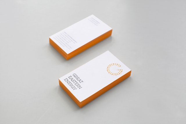
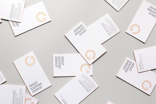
The identity is embossed on stationery and edges of business cards are printed orange.
The identity positions GEE as a unique and innovative energy company.
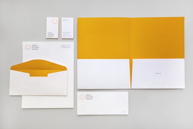
The new identity applied to stationery.
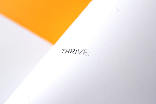
The word "thrive" appears on print collateral.
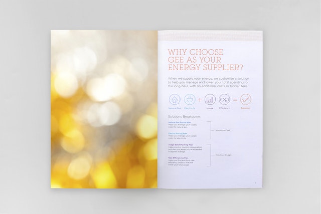
Icons for electricity, natural gas, usage and efficiency use the dots of the logo.
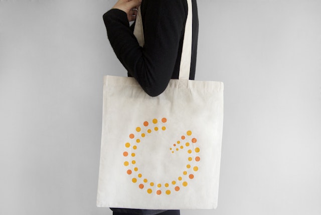
Tote design.
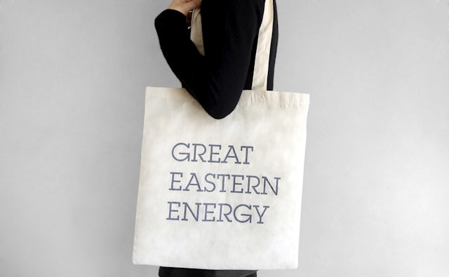
Tote design.
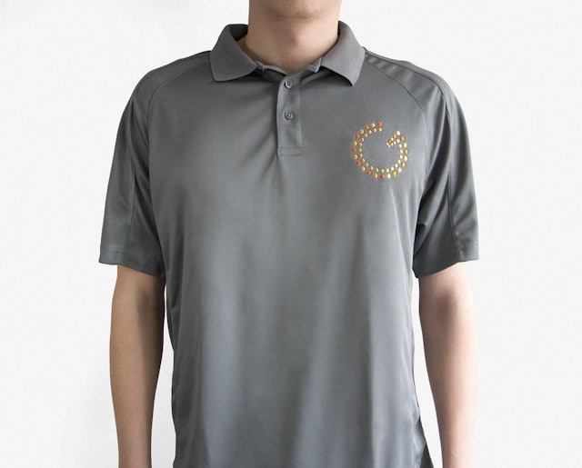
The logo used as an insignia on employee uniforms.
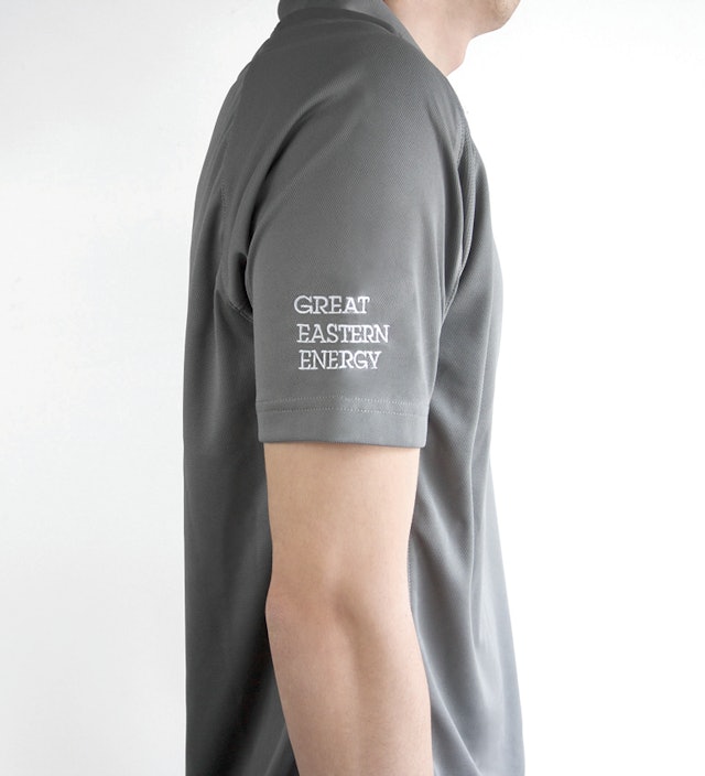
The logotype is set in ITC Lubalin Graph.
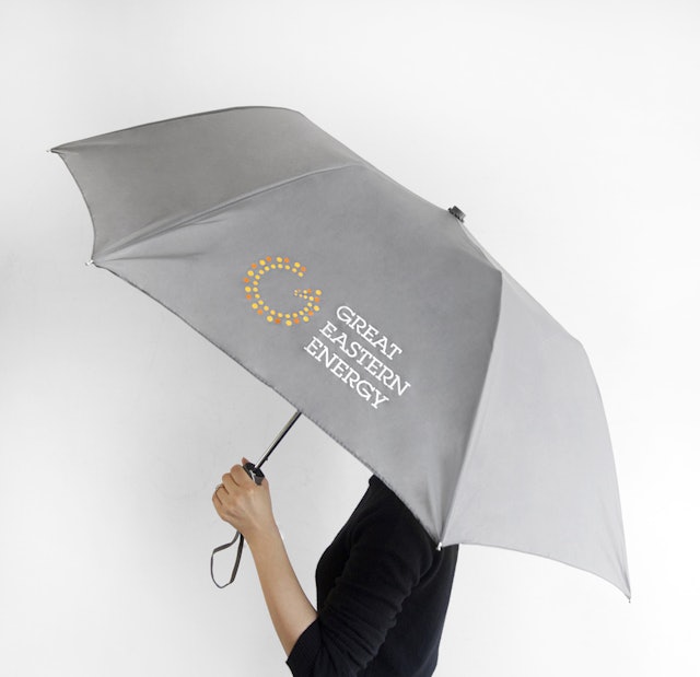
Umbrella design.
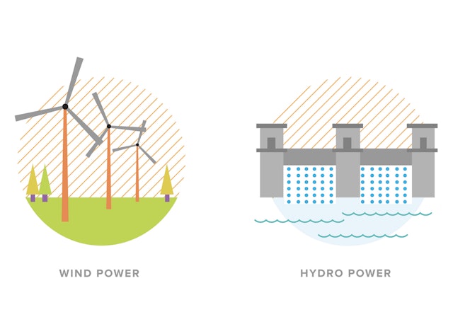
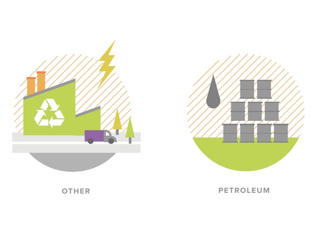
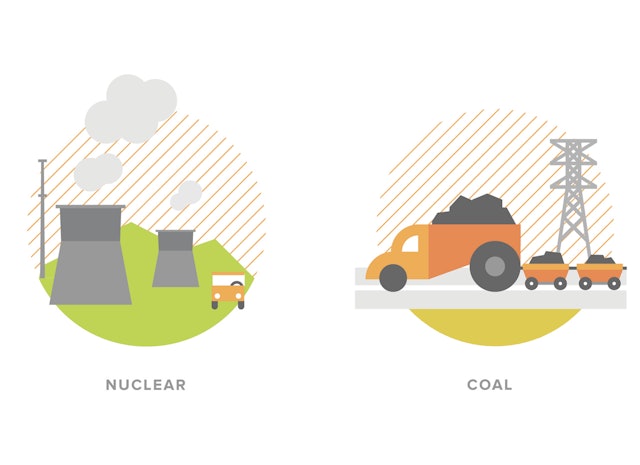
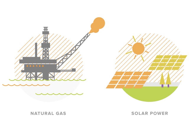
Illustrations of different energy sources created for the infographics section of the website.
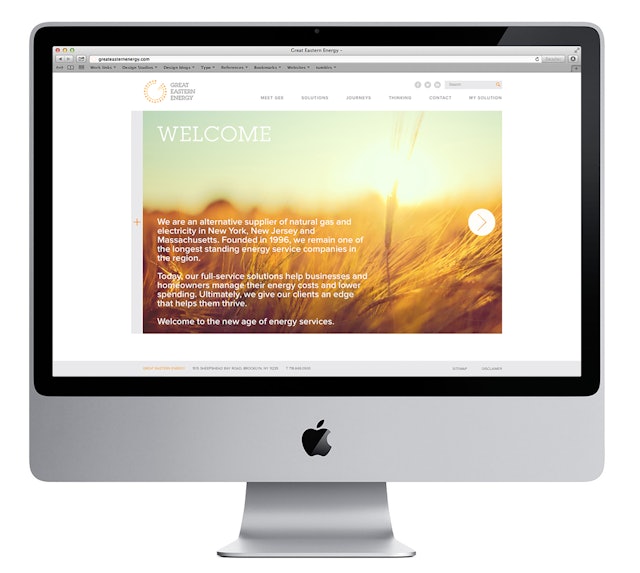
Homepage of the redesigned website.
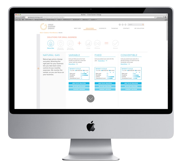
The Solution Builder helps consumers build their own customized energy plans.
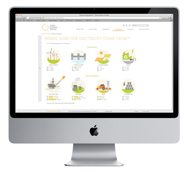
Infographics are used to show where GEE gets its energy from.
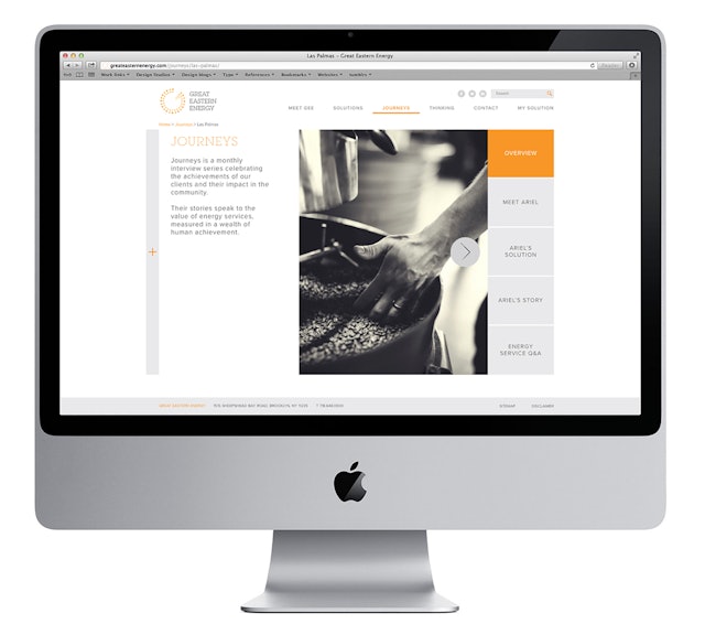
The Journeys section interviews a small business owner about how GEE has helped them save energy.