Grand Central Terminal is one of New York’s great public spaces, a grand gateway to, and beloved symbol of, the city. Opened in 1913, the historic landmark is an architectural treasure, famously saved from demolition in the 1970s and fully restored in the 1990s. It is also one of New York’s most important transportation hubs, serving over 700,000 people daily and home to the nation’s largest commuter rail system, the Metro-North Railroad. In 2013 the building will celebrate its 100th anniversary, which officially kicks off with a birthday rededication on February 1, 2013.
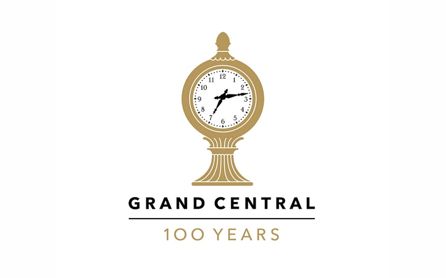
As Grand Central prepares to commemorate this milestone, Pentagram has designed a new logo for the Terminal that will be launched in conjunction with the anniversary. The new logo takes as its inspiration one of the landmark building’s most well known icons—the century-old Tiffany clock atop the information booth in the center of the Main Concourse. The stylized version of the clock, drawn by Joe Marianek, has its hands positioned at 7:13, or 19:13 in trainmaster’s time, a nod to the opening year. The image is centered over the name “Grand Central”; the word “Terminal” has been left out of the logo in recognition of how most people actually refer to the place. Beneath the logo is the simple phrase “100 Years,” which will be dropped when the centennial ends in 2014.
To develop the logo, the designers looked for something more immediately identifiable as Grand Central, different than the antique interlocking-letter monogram that has been in use for many years. The strikingly modern sans serif typeface Avenir was chosen for the logo in recognition that the Terminal will continue to have a vital role in the future of the city. Avenir reproduces well at many sizes, and will be used in logo applications from signage to patches on staff uniforms.
Since its renovation in 1998, Grand Central has become one of New York’s most popular shopping and dining destinations. As part of the identity the designers have created a distinctive graphic language for Terminal marketing, built around the word “Grand.”

