The program appears in a modern palette of dark grey and bright yellow.

The identity applied to stationery.
1 The program appears in a modern palette of dark grey and bright yellow. 2 The identity applied to stationery.

The reverse side of stationery is printed in yellow.

Content on the site homepage is divided into three streams: Projects, Process and News.

Tile view arranges project images into a grid that echoes forms in the firm's work.

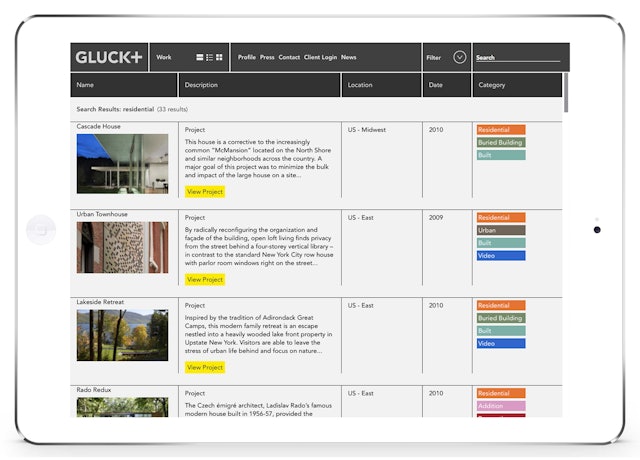
List view sorts projects by name or other factors.

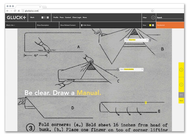
The website functions as a kind of viewer into the firm’s practice.

Slideshows of project images are presented in a widescreen

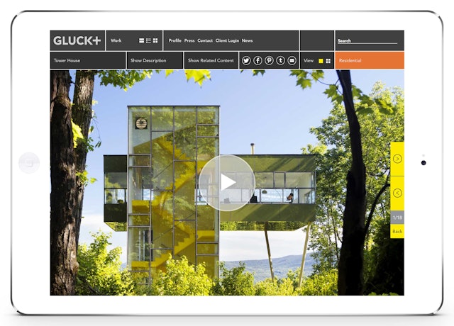
Portfolios of images explore projects in depth.

Search results on the mobile version of the site.

A short film about the Tower House on the mobile version of the site.


