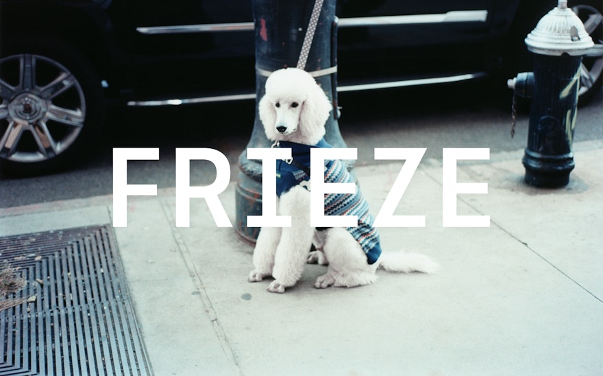
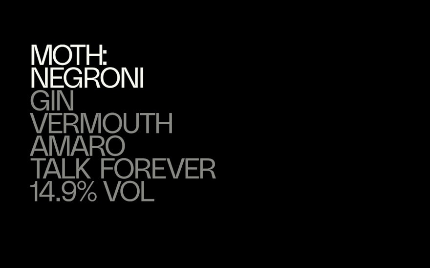
The unique features of the frieze magazine masthead were used to create a modern and ownable typeface to be used across the whole brand. Learn more about the project Play Sound Design by Yuri Suzuki and Maxwell Sterling Zoom Enlarge Zoom Enlarge The custom typeface forms the essence of the brand itself, and unifies Frieze’s sub-brands under one coherent brand architecture. Learn more about the project Zoom Enlarge Zoom Enlarge Zoom Enlarge Zoom Enlarge Zoom Enlarge Zoom Enlarge Although the Frieze typeface performs well at small sizes, it has been paired with Sina Nova, a supporting serif typeface that has a high legibility and lends a warmth and intelligence to the designs. Learn more about the project Play Zoom Enlarge With the new brand design system in place, Frieze’s Creative Director David Lane embraced the brand design system’s capabilities to hero art and envisioned a series of campaigns, starting with the 30th Anniversary and Frieze New York 2021. Learn more about the project Play Play Zoom Enlarge Zoom Enlarge Zoom Enlarge Play Zoom Enlarge It was essential the design system provided the art itself space to breathe. The typeface is characterful & distinctive but does not dictate the layout. Learn more about the project Zoom Enlarge Zoom Enlarge Zoom Enlarge Zoom Enlarge Share: Twitter, LinkedIn, Email