The site applies a ‘frankness’ to the featured issues, with a point of view that is forthright, personal and thoughtful, in long-form essays, interviews, opinion pieces, photo stories and video documentaries.


The website takes its cues from classic newspaper design, with a masthead, rule lines and a gridded structure that is easy to scan.


Frank is an online publication co-founded by Tatti Ribeiro and Clare McLaughlin that explores a single theme in depth each month, with new content delivered almost daily. With social issues as a starting point, the site has taken a comprehensive look at subjects as varied as immigration, activism, the U.S. military, urban planning and plastics. Pentagram has designed a brand identity and website for the media startup that captures its fresh, authoritative take on the news and invites readers to join the discussion.
Frank’s distinctive name was inspired by Gregory Frank, a military man with a direct approach who was a neighbor of Ribeiro while she was growing up. The site applies this “frankness” to the featured issues, with a point of view that is forthright, personal and thoughtful, in long-form essays, interviews, opinion pieces, photo stories and video documentaries. Contributors are experts in their fields, in line with the site’s mission of “understanding the world yesterday, today and tomorrow.”
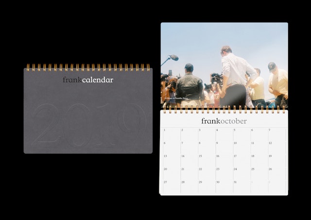
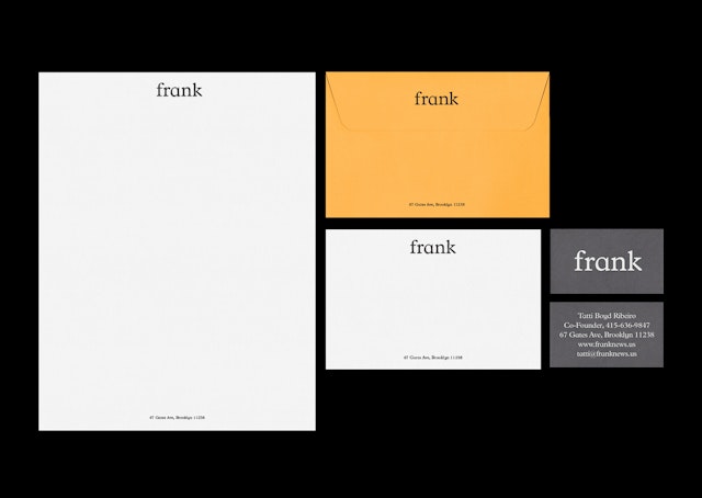
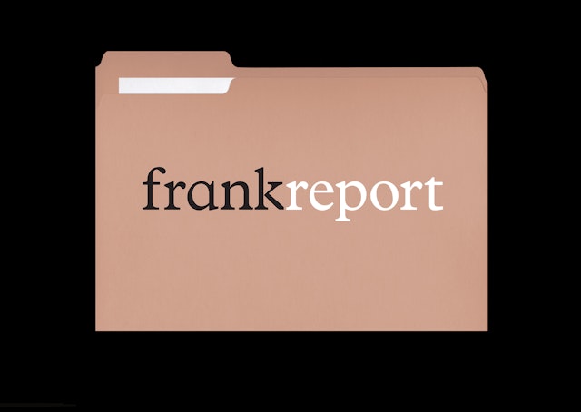
The Frank brand identity is straightforward, welcoming and accessible, with an understated all-lowercase logotype set in the old-school serif Plantin Schoolbook, and Helvetica as a supporting typeface. The typography of the wordmark works well at different sizes, scaling up to show details and proportions. The brand architecture uses “Frank” as both a prefix and descriptor, setting up categories and departments as their own sub-brands: Frank Photos, Frank Interviews, Frank Debates, and so on. Each is assigned a specific color, creating a cohesive system.
The website, developed with RANGER, takes its cues from classic newspaper design, with a masthead, rule lines and a gridded structure that is easy to scan. The clean, clear design extends to the navigation, which allows readers to sort by issue and features a calendar view that shows complete coverage of a topic throughout the month. Pentagram also developed a cohesive look for the maps, charts, diagrams and other infographics that accompany stories or are stand-alone features themselves.
Client
FrankSector
- Publishing
- Arts & Culture
- Technology
Discipline
- Brand Identity
- Digital Experiences
