First Round Capital is a leading venture capital firm that has backed more than 150 companies, including category innovators such as Square, Uber, Fab, Warby Parker, Hotel Tonight, Refinery29 and One Kings Lane. First Round does exactly what its name says, providing seed-stage funding for the first 18 months of a startup, the most critical period for a new business. At the same time, the firm builds a sense of camaraderie among the companies it supports, looking at them as a community rather than a portfolio.
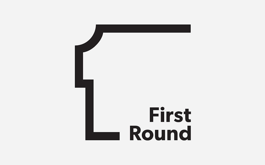
Pentagram has designed a new identity for First Round that conveys the firm’s unique point of view. The logo eschews typical VC imagery like financial symbols and growing trees for something more modern and elemental: A simple line derived from the number “1,” inspired by the company’s name. The line suggests the diagram of a floor plan, with one side left open to convey a sense of possibility. The shape of the line also creates a profile, hinting at the personal, one-to-one connections valued by the First Round. The logo is balanced by the company’s name, set in the sans serif font Gibson.
The new identity launches as First Round celebrates its 10th anniversary. Over the past decade, First Round has reimagined the role of the VC as mentor, taking a holistic approach that, in addition to providing financial backing, gives companies access to a sophisticated network of support, from its collective community of founders, CEOs, employees and investors, to engineers, designers and developers, to valuable introductions to many of the world’s largest companies, opening doors to further opportunities. Like the entrepreneurs it backs, First Round is actively engaged in changing how the world works. It also has a healthy sense of humor, something that can be seen in its infamous holiday videos.
First Round produces extensive resources for its companies, and the new identity ties these pieces together into a flexible, cohesive system. First Round has custom-built its own powerful digital platform that functions as an information exchange for its community, sharing startup knowledge and contacts. Last year the firm established First Round Review, a blog that publishes stories about creative entrepreneurs.
The openness of the First Round logo extends to communications like the website and digital platform, which incorporate white space for a clean, uncluttered look. The logo also appears in a bright, friendly palette of contemporary colors like neon green and orange in collateral like stationery, totes and buttons.

