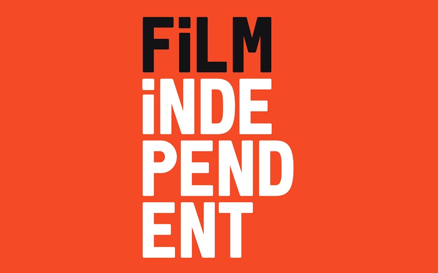
Pentagram has created a new identity for Film Independent, the non-profit organization that champions independent film through a variety of programs and events. Designed over the past year, the branding uses vibrant colors and a custom typeface inspired by the rich heritage of film to establish a fresh new look for Film Independent and its programs.
The Spirit Awards are one of the many components that make up Film Independent, and the branding was incorporated into all of the graphics for the ceremony, from the title sequences, animations introducing each category, and other on-air graphics, to the promotional campaign, program and tickets.
To develop the new identity, Pentagram collaborated closely with the leadership of Film Independent, including President Josh Welsh and Director of Marketing Maggie Moe, as well as a special task force from the Board: Mary Sweeney, Sue Kroll, Alan Poul and Allan Mayer. Film Independent wanted a cohesive system that would encompass all of its extensive offerings. Founded in 1981, the organization is a non-profit arts organization that champions creative independence in visual storytelling and supports a community of artists who embody diversity, innovation and uniqueness of vision. In addition to a host of annual screenings, educational events and artist development programs, Film Independent's signature events include: the Film Independent Spirit Awards, the LA Film Festival, and the year-round Film Independent at LACMA series.
Over the past 30 years, independent film has evolved through major changes, moving from the margins to become an important force in the industry. Award-winning films like Spotlight, The Artist, Birdman, Boyhood and 12 Years a Slave all have roots in the independent community, and more people than ever have access to independent films via online services and digital streaming. One of the goals of the new identity was to shift away from the stereotype of the grungy “indie” of the 1980s and 90s to something more sleek and contemporary, but still retaining its attitude and spirit.
The length of the “Film Independent” name was a fundamental concern. The wordmark of the previous identity, in use since 2011, placed the name all on one line, and the organization was looking for something that was a little more versatile. The existing logotype also marked up the word “film” with a gritty grease pencil, which reinforced the rough indie stereotypes. The new identity breaks up the Film Independent name in stacked and shifting typography. The words can be split up (or cut, to use film editing terms) and spliced and reassembled into multiple offbeat shapes, stacks and compositions. The dynamic system embodies the flexible, unconventional spirit of Film Independent, as well as the way film is constantly in motion.
The approach easily extends to the sub-brands of the various programs, which can now more successfully incorporate the Film Independent name within their own individual logotypes. The designers provided a set of many lockups for each of the logos, but gave Film Independent their blessing to break up the logos any way they wish.
Tying it all together is the distinctive typography, set in Font Independent, a custom typeface drawn in collaboration with the Swiss type foundry Grilli Type. The letterforms’ softened corners lend the brand approachability, giving it a subtle “printed” look in a nod to early movie posters and theater marquees, without being rough around the edges or overly mechanical. The condensed typeface saves space, and the clean letterforms are an intentional departure from the DIY aesthetics commonly associated with independent film. Expanding on the logo’s malleable nature, the type can be broken up for unique graphic uses.
Running throughout the typography is the ubiquitous lowercase “i,” shorthand for the multifaceted individuals who make up the organization—putting a little “independence” into every word. The lowercase “i” is also a nod to the typography of iconic title sequences like Jean-Luc Godard’s New Wave classic Made in U.S.A., among others. (Coincidentally, similar typography is utilized in the title sequence for Birdman, which also echoes the Godard titles.) A shortened “Fi” icon was also created for social media, further building on this concept.
Aspects of the new look were previewed in two projects Pentagram completed over the past year, both for events produced by Film Independent. The clean, rearrangeable type was hinted at in the graphics for last year's 30th Film Independent Spirit Awards, and the stacked typography was utilized in the campaign for the LA Film Festival. These endeavors allowed the team to test some of the core concepts that would ultimately be included in the new identity.
Rounding it all out, the color palette, color-treated images and “image bands” further reference the heritage of film but are used in updated ways to emphasize the organization as a forward-looking entity within the industry. A coordinated color palette uses distinct colors for each of the major events and programs. Warm red is the main brand color, while a royal blue represents the Spirit Awards, and a modern purple is used for the LACMA series. Sunny yellow is the color of the LA Film Festival, and a vivid green is used for the programs that foster artist development. The palette evokes the colors in old film posters, but the brightness has been turned up to make the hues feel fresh and to look better online.
The designers also worked on new messaging for the organization. Built around the statement “I Am Film Independent,” the messaging puts the focus on the individuals who contribute to the creativity of independent film. The concept has been brought to life in a short film made in collaboration with the award-winning filmmaker Ryan Velasquez, a directing fellow of Film Independent’s Project Involve program, a free nine-month program for writers, directors, producers, editors, cinematographers and entertainment executives from diverse backgrounds. The film was introduced at the Spirit Awards, and several variations will be featured in the coming months.
The designers continue to implement the branding across Film Independent’s various platforms, working closely with Film Independent Director of Marketing Maggie Moe and Senior Graphic Designer Patricia Lindberg. Coming attractions include a new Film Independent website, designed by Pentagram in collaboration with Barrel and set to launch later this month.

