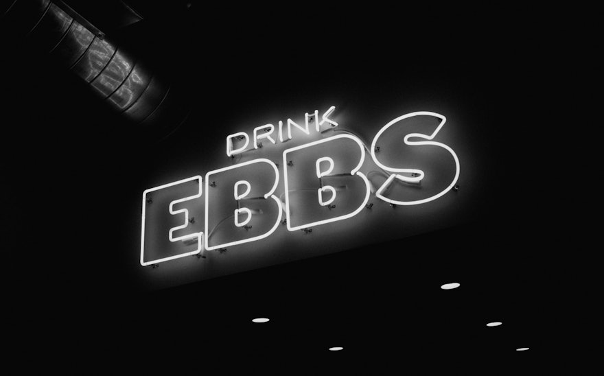
With the boom in craft brewing, beers have become ever more over the top, setting themselves apart with esoteric ingredients, unusual names and elaborate packaging. EBBS is a new Brooklyn-based brewery that clears all that away and takes beer back to the basics. Pentagram has created a brand identity and packaging for EBBS that reflects the brewery’s simple, straightforward approach and no-nonsense New York attitude.
EBBS is based in Williamsburg and its beers are made of high quality, locally sourced ingredients. The branding is an homage to New York City, and especially the people of NYC, who appreciate clarity, candor and telling it like it is. Pentagram consulted on naming and messaging for the brewery. The name “Ebbs” is short, strong and simple, evoking water and New York’s rivers and harbor, as well as Ebbets Field, the home of the Brooklyn Dodgers baseball team. The local point of view is captured in the brewery’s tagline: “Born in Brooklyn, brewed for the people.”
This directness carries through to packaging that is just-the-facts but still makes space to be creative. The designers developed a simple structure and typographic framework for labels that function as a kind of blank canvas. Forgoing crazy names, the beers are identified by the style of brew and recipe number, such as Lager No. 1, Stout No. 1 and IPA No. 5. The logo and primary typography are set in the bold throwback Original Sans, one of the first sans ever released (in 1828) and recently revived by Commercial Type.
Each beer is distinguished by a different black and white illustration that is humorous, witty or abstract. The first brews feature collaborations with illustrators Chris DeLorenzo, Lennard Kok, Pol Monserrat and Andreas Samuelsson. The packaging is black and white, but leaves open the possibility for color in the future––as long as it’s nothing too fancy.
