Pentagram and strategist Simon Paterson have created a new visual identity for Domaine Thomson, a New Zealand-based wine producer famous for their biodynamic Pinot Noir. The rebrand followed their acquisition of a new vineyard in Gevrey Chambertin, France, and the need to visually communicate this growth to a new hemisphere.
Founded by PM Chan and David Hall-Jones, Domaine Thomson began life as a single vineyard in Central Otago, New Zealand. The brand was originally named Surveyor Thomson, after Hall-Jones’ great-great-grandfather, John Turnbull Thomson, who was New Zealand's first Surveyor General.
Although the brand had a deep connection to New Zealand, it did not reflect the new addition of a vineyard in France. The solution was to rename it Domaine Thomson, retaining John Turnbull Thomson’s surname and prefacing it with the French word for vineyards.
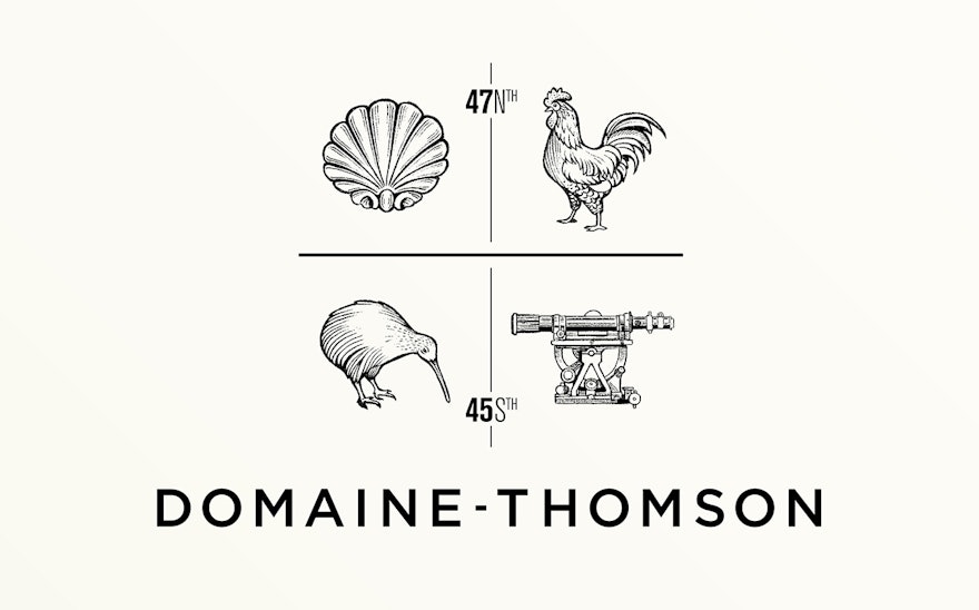
Pentagram created a new logotype that is a twist on a traditional crest, which use symbols to illustrate the brand’s story. Unlike a conventional crest, the symbols are not integrated and are pulled apart to honour each component. Both vineyards are given equal importance, with France above the centre line and New Zealand beneath.
The cockerel and kiwi represent France and New Zealand respectively, with the scallop shell and theodolite representing the locations of the vineyards. The theodolite is an homage to Surveyor Thomson, and is a drawing of the exact one used by John Turnbull Thomson during his surveying expeditions in New Zealand. The scallop shape comes from the stone fireplace of Chan and Hall-Jones’ home in Burgundy. Their home lies on one of the routes of El Camino de Santiago and the scallop has long been popular with pilgrims to the shrine of the apostle St James in Santiago de Compostela.
The colour palette similarly reflects the locations of both vineyards. The selection of earthy browns, greens and yellows are all inspired by the stones, moss and leaves that are specific to France and New Zealand.
Pentagram also introduced ‘the parallels’, a graphic device which brings the dual hemisphere story to life. Placed on the back labels of each bottle, ’the parallels' are two key lines that turn the labels into maps that show the location of the vineyards in relation to each other.

