
The notion of “henkaku”—a Japanese word meaning roughly “radical change”—served as a north star for the team, mirroring the spirit of the Lab and the values it seeks to embody.



At the center of the identity is a colorful mark meant to represent the seemingly contradictory ethos at the heart of the Lab’s mission: decentralization and collective action.
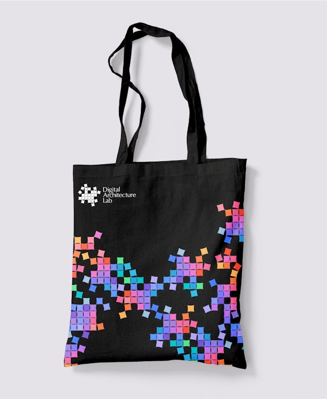

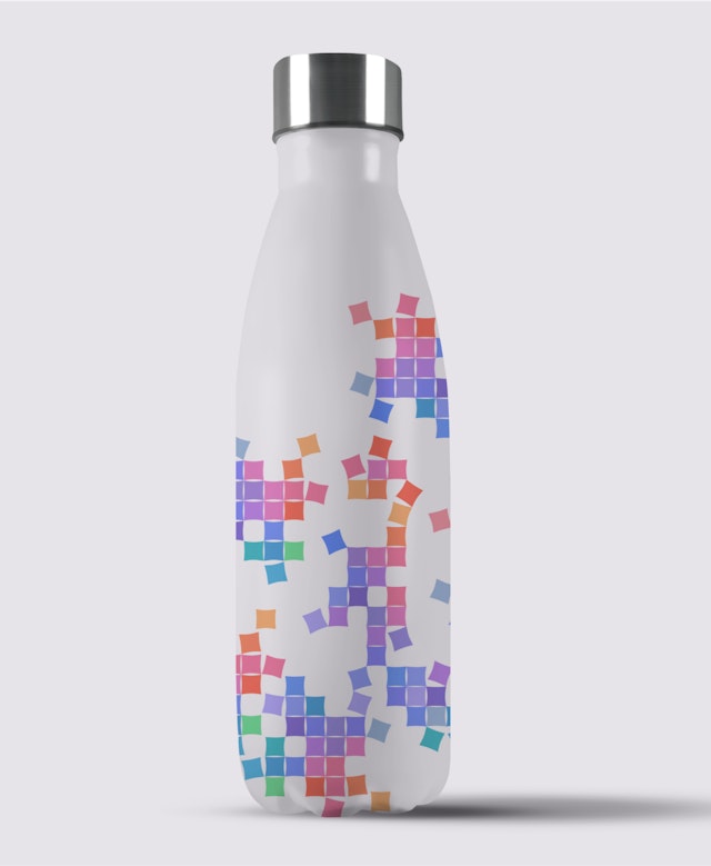
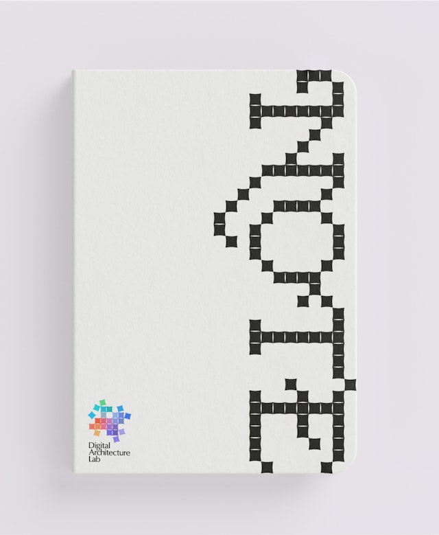
Currently, web3 culture is epitomized by tech-y purples and neon greens, often used with gradients. The Digital Architecture Lab team wanted to nod to these conventions, but offer an alternative to such intense hues in keeping with its unorthodox approach to technology.

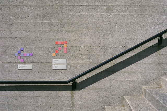
Digital Architecture Lab is an innovation initiative focused on navigating our current moment of radical societal change. Part of Digital Garage, the Japanese technology leader, the Lab functions like an internal research & development unit, applying the decentralization principles of the web3 movement and other humanist philosophies to solve new problems in a rapidly changing environment. Pentagram partner Giorgia Lupi and her team have developed a new visual identity for the Lab, giving shape to the Lab’s distinct ethos and community.
The identity was the product of a uniquely expansive process with the Digital Garage team. The notion of “henkaku”—a Japanese word meaning roughly “radical change”—served as a north star for the team, mirroring the spirit of the Lab and the values it seeks to embody. Influenced heavily by Japanese culture and web3, Henkaku is a new vision for human futures that champions tenets such as decentralization, inclusion, democracy and sustainability in society. Henkaku intends to be not just an intellectual philosophy for our current era of digital transformation, but also an aesthetic one, similar in ambition to the Bauhaus movement of the 20th century that arose on the heels of the Industrial Revolution. The Digital Architecture Lab team wanted to use their identity to explore how the values of henkaku might manifest in a new visual language.
The project started with a rigorous research phase to identify diverse aesthetic predecessors that might resonate with the Lab’s ethos. The team amassed a sizable visual lexicon from which to draw, ranging from historical examples of Japanese art, theater, textiles and performance, to the more recent work of noted design masters like Ikko Tanaka and Kenya Hara, and contemporary architecture of SANAA and Tadao Ando. Ancient cosmology and the Japanese religious tradition of shinto were also important references, as were humanist forms of counting and data visualization. The outputs of the research phase included a written report summarizing the team’s findings and a series of design pillars that would help inform the forthcoming visual identity.
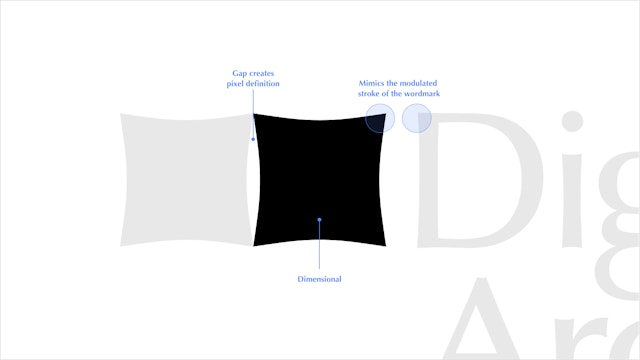
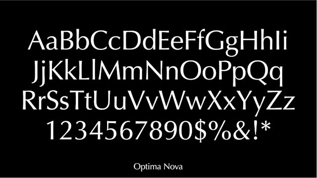
At the center of the identity is a colorful mark meant to represent the seemingly contradictory ethos at the heart of the Lab’s mission: decentralization and collective action. Constructed of 25 parallelograms, or “soft pixels” as dubbed by the Lab, the icon evokes movement and activity—seemingly random, but in fact structured and organized to achieve impact. The curves of the soft pixels, with subtle concave curvatures, are modeled after Optima Nova by Linotype, the Lab’s brand typeface. Optima is a mainstream humanist sans serif that embodies feelings of warmth, approachability, and humanism that are also important to the brand’s positioning. For Japanese characters, Noto Sans is recommended.
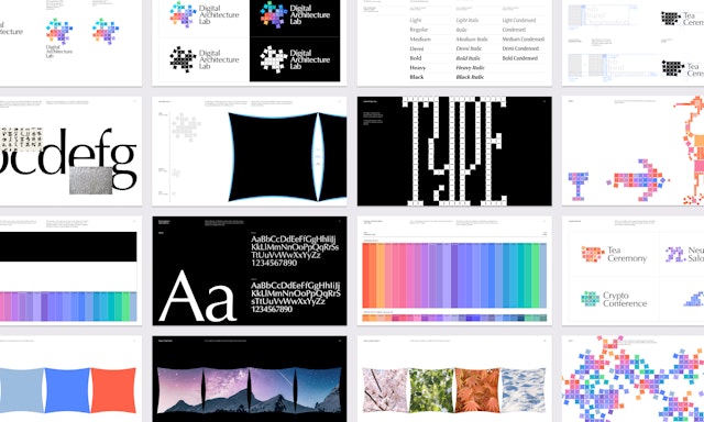
Color was also an important consideration. Currently, web3 culture is epitomized by tech-y purples and neon greens, often used with gradients. The Digital Architecture Lab team wanted to nod to these conventions, but offer an alternative to such intense hues in keeping with its unorthodox approach to technology. The design team created a full palette of 25 different colors along a spectrum, running the gamut from green to blue to purple to orange to yellow. Each soft pixel in the logo is assigned one of these colors. Within the full palette, a variety of tonalities are also possible: for instance, reserved greens and blues for more institutional applications, while brighter orange and yellows for public-facing initiatives.
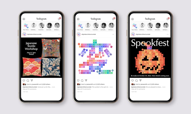
The resulting design system shows the flexibility and mutability of the soft pixel motif. The pixels can be rearranged endlessly to create illustrations, patterns, symbols, even typography. As the Lab expands, sub-brands or event graphics can easily be generated with the pixels, ensuring the entire brand feels cohesive.
Office
- New York
Partner
Project team
- Phillip Cox
- Madeleine Garner
- Talia Cotton
- Nikki Makagiansar
- Ed Ryan
- Lindsay O'Connell
