Data can describe the details of our daily lives, revealing the hidden patterns that make us who we are. “Dear Data” was a yearlong data drawing collaboration by Giorgia Lupi (prior to joining Pentagram as a partner) and the London-based information designer Stefanie Posavec. Each week, for a year, the designers sent each other a transatlantic postcard with analog, hand-drawn data describing what had happened during the week. Over the duration of the self-initiated project, the pair became good friends, using data as their primary source of communication.
Every Monday the designers chose a particular subject or theme on which to collect data about themselves for the whole week: how often they complained; the times they felt envious; the positive thoughts they had; when they came into physical contact, and with whom; the sounds they heard; the doors they passed through. They then created a drawing representing this data on a postcard-sized sheet of paper, and dropped it into an American mailbox (Lupi) or an English post box (Posavec). Eventually, the postcard arrived at the other person’s address with all the scuff marks of its journey over the ocean—a type of “slow data” transmission.
Equal parts mail art, data visualization and affectionate correspondence, the project treated data as a creative material—like paint, paper or clay—and a starting point for play and expression. The front of the postcard would display a unique representation of the weekly data and on the reverse (in addition to the necessary postage and address), the designer would squeeze in detailed keys to her drawing, a code to enable the recipient to decipher the picture and to imagine what had happened to her new friend the week before.
“Dear Data” was conceived as a “personal documentary,” rather than a quantified self-project, which is a subtle, but important, distinction. Instead of using data just to become more efficient, the designers argued that it can be used to become more humane and to connect with ourselves and others at a deeper level.
Over the 52 weeks, the collecting of data became a kind of ritual. The designers would spend the week observing and noting down their activities or thoughts, before translating this information into a hand-drawn visualization. Data became an alphabet and language to describe their lives and thoughts to the other person, demonstrating that it is not necessarily big, scary or burdened by technology: it can be a very human filter we can use to parse our world, and a creative material to design with.
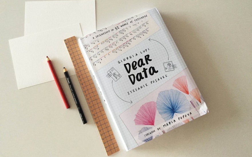
Lupi and Posavec documented the project in the book Dear Data (2016), which reproduced the original 52 pairs of postcards, followed by Observe, Collect, Draw!: A Visual Journal (2018), a guide for readers to create their own visual languages for their data. (Both titles are published by Princeton Architectural Press in the US and Penguin Press/Particular Books in the UK.) What started as a personal project has reached a wide audience of non-designers, who can experiment with their own data collections, and educators, who use the activity as an exercise for students.
The Museum of Modern Art in New York acquired the original set of 104 data postcards and accompanying sketchbooks for its permanent collection. The project was nominated for the Design Museum’s prestigious Beazley Designs of the Year 2016 exhibition and honored in the Kantar Information is Beautiful Awards 2015.

