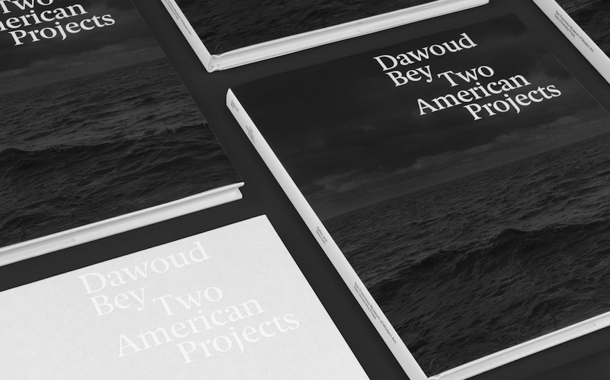
Dawoud Bey is a photographer, educator and social activist with a commitment to picturing the lives of Black Americans and other marginalized communities and the ongoing struggle for civil rights. Two of his most important series are featured in Dawoud Bey: Two American Projects, a new monograph published by the San Francisco Museum of Art with Yale University Press. Pentagram created a design for the book that highlights the juxtapositions at the core of the artist’s work.
The book accompanies Dawoud Bey: An American Project, a major retrospective presented by SFMOMA and organized in conjunction with the Whitney Museum of American Art. (The show opened at SFMOMA shortly before the museum closed for the Covid-19 pandemic, and may be extended once it reopens.)
Bey is a recipient of the 2017 MacArthur Fellowship. His large-scale pieces combine the rigor of conceptual art, the classical craftsmanship of photography, and the immediacy of the current moment. The two series in the book, which are presented as installations when exhibited, represent a departure from his color photography with monumental black-and-white images that focus on historical events and collective memory.
Night Coming Tenderly, Black (2017) evokes the experience of a slave fleeing to freedom via the Underground Railroad in Ohio, navigating forests, fields and streams at stops along a network of safe houses and churches. The immersive, large-scale landscapes (the exhibited prints measure 44 x 55 inches) are dark and powerful, and put the viewer on the outside looking in past picket fences and thickets.
The Birmingham Project (2012) is a tribute to the six Black youth killed in the Ku Klux Klan bombing of the 16th Street Baptist Church on September 15, 1963, a turning point in the civil rights movement. Portraits are paired into diptychs that bridge generations: on one side, a child the age of the young girls and boys who perished in the bombing and its aftermath, and on the other, an adult 50 years older, about the age the murdered child would have been when the picture was made. Some were taken at Bethel Baptist Church, a center of civil rights organizing in the city. The project originally debuted at the Birmingham Museum of Art in 2013, the 50th anniversary of the bombing.
The Pentagram designers wanted to create a strong but neutral framework for the series. Formal conceptual arrangements of images into grids and pairings are a signature of Bey’s work. In the book, the series have been paired themselves, side by side, to represent two different projects from the same artist that tell a linked story––past and present, landscapes and portraits, slavery and terrorism.
The book design is quiet and subdued, allowing the work to speak for itself. Juxtapositions in typography echo the contrasts in the series and suggest a demarcation between two worlds. Type is arranged to emphasize certain words and phrases, hinting at motion and shifts in time and perspective while also creating tension within the space of the page. Titles are set in Berlingske Serif, a modern version of a classic calligraphy-built serif (designed by Playtype) that evokes a sense of history. The serif typeface Bradford (by Lineto) and sans serif Whyte Inktrap (by Dinamo) are used for text.
The cover typography introduces the concept with Bey’s name and the book title balanced in a careful composition. Inside, the table of contents progresses across a full spread, almost like a timeline. The title of Night Coming Tenderly, Black is taken from the poem “Dream Variations” by Langston Hughes, which appears before the works with an expressive type treatment that reflects the poem’s language of movement.
The two series are placed within a sequence of curatorial essays that offer insight into Bey’s art and historical context on the featured works. The illustrated texts have a visual richness that supports the photographs of the series. The design employs a three-column grid with the essay titles counterbalanced by images that are staggered salon-style within the bodies of text.

