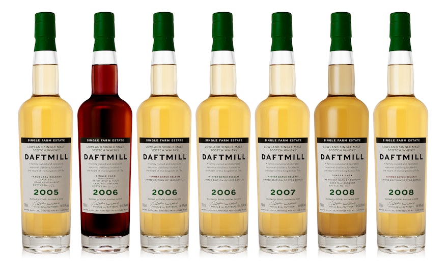
Pentagram has designed the brand identity and packaging for a range of artisan whisky produced by Daftmill, one of Scotland’s smallest distilleries. Due to its limited production, very few bottles of are Daftmill are made available for sale—whisky aficionados can apply for a bottle of its latest Winter batch (featuring aromas of freshly baked sponge, cardamom and peach skin) through an online ballot hosted by its distributors Berry Bros. & Rudd.
Producing only 20,000 LPA (about 100 casks per year), Daftmill is the only distillery in Scotland that can use the ‘Single Estate Farm Distillery’ tag line. Although established in 2005, and despite having over 10 years’ worth of stock, Daftmill didn’t release a single bottle of whisky until 2018. One of just nine distilleries in the Lowlands, Daftmill ages its single malt whiskies for 10 years or more. During this time some of the alcohol gradually evaporates—this is known as the ‘angels’ share’.
Brothers Francis and Ian Cuthbert are descended from a long line of farmers—six generations of their family have grown malting barley and other crops alongside a herd of beef cattle at their farm in Fife. Fifteen years ago they decided to diversify, creating a micro-distillery in some of their disused farm buildings to make whisky from barley grown on the farm and water from its artesian well.
The distillery operates in perfect harmony with the farm. After the barley is mashed, the spent grains are fed to the cows, with the leftovers from the distillation used as a fertiliser for the fields. The warm water from the stream used to cool the stills is either kept for the next mash, or pumped into the duck pond, which helps stop the pond from freezing over in the winter. The name Daftmill stems from the seemingly ‘daft’ burn (or stream) on the Cuthbert’s farm that appears to run uphill; over time the mill on the stream took on its name, becoming known ‘Daft’.
Pentagram was asked to create an identity that would define Daftmill as a unique brand with genuine provenance, confident enough to rely on the quality of its distillate and the integrity of its production. To get a real sense of what makes Datfmill so unique, Harry Pearce travelled to Fife to meet the brothers, sample the product and capture a photographic record of the farm and the distillery. This photo-essay proved central to the design development.
The look and feel needed to be understated, straightforward and down to earth, emphasising the authenticity of this high-quality product. Eschewing the vintage look favoured by most generic whisky brands, the design team took a purely typographic approach, choosing the idiosyncratic Caslons Egyptian, which is used in Light, Regular and Bold. Each release lists the actual casks the liquid was sourced from, and the exact number of bottles created from that batch.
Emphasising the rare and collectable nature of this exceptional product, on the label the year of production is given equal weight to the distillery’s name. For the smaller batches, numbering is handwritten directly to the labels. The dark green accent on the label and the foil contrasts with the black type, and is inspired by the paintwork found on buildings around the farm.
The new identity has a modern yet timeless quality and reflects the honest, authentic values of the Cuthbert brothers and their very special product.
Daftmill is available from Berry Bros. & Rudd.

