For nearly forty years, the Cornell Laboratory of Ornithology has been represented by a stylized “everybird." Paired with an all-capitals serif wordmark, the old logo served the lab as it grew from a local academic initiative of about two dozen employees to an organization of more than 250 around the globe, housing among its assets the world's most comprehensive collection of recordings of bird calls and other wildlife sounds. Feeling the need to update its image to match its standing and worldwide influence, the Lab turned to Pentagram for a new brand identity.
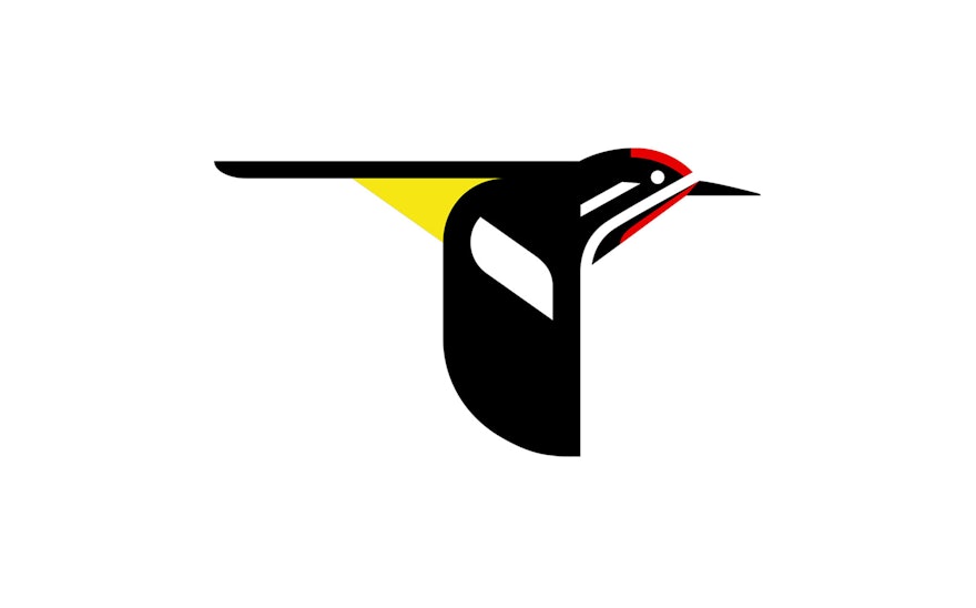
Interestingly, the designers adopted a smaller and more local bird for the bigger and more far-reaching organization. He took stylistic inspiration from the artwork of Charley Harper, whose association with the Ornithology lab can still be seen in signed prints and originals throughout the building. The new mark is adapted from one of Harper's classic paintings. The angular and monotone everybird, variously and vaguely interpreted as a peregrine falcon or a tree swallow, gave way to a Yellow-bellied Sapsucker.
The colorful new mark, with its rounded form and red, yellow, and black palette, has been combined with the softer title case typefaces Avenir and Mercury to give it an overall friendlier feel than its predecessor. The new logo maintains the scientific respectability of the Lab—hence the boldface Cornell to emphasize the research university connection—but also projects a welcoming and friendly face to greet the hundreds of thousands of bird enthusiasts who look to the lab as a nesting place for their studies.

