L’Oreal launched Color&Co, a revolutionary approach to personalized at-home color, to solve two problems: first, that hair color had become associated with and mainly marketed to people trying to cover up their graying strands and signs of aging, and second that it was almost impossible to have a salon-quality hair color experience at home, even though that’s where almost 50% of users dye their hair. Leveraging L’Oreal’s centuries-long experience in hair care and new forms of emerging technology, Color&Co was created for people of all ages who use hair color as a form of self-expression. Eddie Opara and team designed a fun, flexible, and dynamic identity system that helped Color&Co stand out in the crowded, yet somewhat homogenous, hair color market with flair.
While previously users had to approximate and match their expectations with the images on the hair color packaging, Color&Co offers each customer a video consultation with a hair colorist, following which they receive a customized kit of everything they need to color their own hair—leading to customized shades and nuanced application techniques.
“We saw an opportunity to reinvent the at-home hair color experience,” said Olivier Blayac, General Manager of Color&Co. “We knew that up to 70% of at-home color users don’t know exactly what hair color works for them and worry about unpredictable color results. We wanted to fix that problem.”
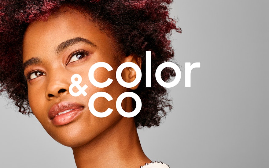
The Pentagram team designed an identity system that emphasized the brand’s high-quality offering with warmth and fluidity. The team created a modern, geometric logotype in customized Sharp Sans Display No. 1 with a custom-drawn ampersand, and paired this with a rich set of icons, photography assets and color pairings. The color system is the source of the brand’s freshness: it draws from references across modern art and brings together a striking, bold hue with a delicate pastel shade, creating drama and life in its pairing of dusty rose with scarlet red and mint green with electric blue. The iconography system depicting the hair color process was also was built out of distinct lines drawn in the two color pairings. The art direction for the photo assets focused on highlighting diverse hair textures and people—moving away from conventional, airbrushed-to-perfection imagery. Across the brand’s various touchpoints, from the website to the packaging design, these brand elements joyfully play off each other.
Color&Co is part of the new tech-powered wave in the beauty industry. But it stands out because of its focus on human connection and customization. Pentagram’s design system highlights the brand’s unique positioning while also mirroring the contemporary approach to beauty as a form of self-expression: it is individualistic, playful and endlessly adaptable.

