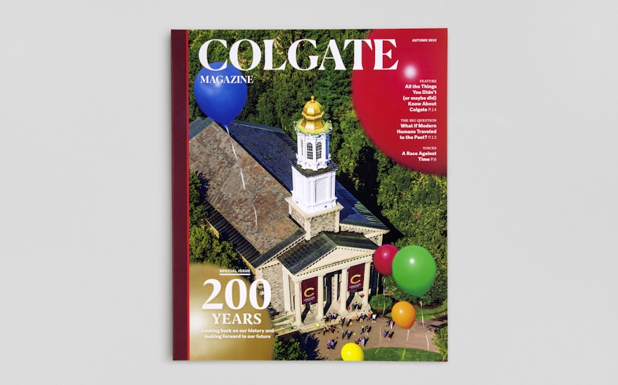
Colgate Magazine is the alumni publication of Colgate University, the prestigious private liberal arts college in Hamilton, New York. Pentagram completed a redesign of the magazine that captures the spirit of Colgate and helps it better connect with its community. The update was timed to the university’s 200th anniversary in 2019 as well as the launch of a new institutional identity for the school, also designed by Pentagram.
The Pentagram designers collaborated on the project with Colgate editor Aleta Mayne, the University communications team, and the editorial consultant Jay Heinrichs, who has worked extensively with schools on publications. Colgate wanted the magazine to reflect the strategic vision set out by President Brian W. Casey, who has a bold ambition to make the university the finest educational institution of its kind. As part of the new identity, brand positioning was developed that highlights the qualities that set Colgate apart, and the new visual language and verbal messaging reinforce the stature of the school with more gravitas and confidence.
The refresh pulls the magazine in line with the new identity, conveying the heritage of the 200-year-old institution, but in a contemporary way that feels dynamic and meaningful. The focus of the content has been sharpened to emphasize the personalities and ideas behind the school, the beauty of the campus, and the vibrant energy of the alumni, faculty and diverse fields of study, with details that feel true to the Colgate experience.
In its previous iteration, the publication was called the Colgate Scene and was produced in an oversized format. The designers changed the name to Colgate Magazine to reinforce the University’s identity and made “Scene” the title of a front-of-book department of campus news. The dimensions have been reduced to a more portable, easy-to-handle size that feels more like a standard magazine.
The redesign is built around elements of the new identity. The nameplate is Colgate’s new wordmark, set in the contemporary chiseled serif Portrait (designed by Berton Hasebe at Commercial Type). The logotype appears in all uppercase, conveying a sense of strength and vitality. The spine sports the traditional Colgate maroon, along with a bright red accent that was brought in as part of the expanded brand palette, and the new “C” monogram is featured on the back cover.
The update is more visual, with greater use of commissioned illustration, photography and infographics. The magazine pushes this to the forefront with “Look,” an opening section of striking images of the campus and Colgate life stretched across full double-page spreads. The publication relaunched with a special bicentennial issue, and introduced “Look” with the official illustration of the Colgate landscape, rendered by Steven Noble as a traditional black-and-white engraving. The cover featured a drone photograph of balloons floating above the beautiful Colgate Memorial Chapel.
Inside, the redesign introduces a more navigable structure with numerous entry points, and incorporates the history and traditions of the school. Sections and departments were created and remade to clearly organize different story types. The design adds visual texture and detail—spot illustrations, pull quotes, and data points—to make the publication richer and more active, and to offer more entry points for the reader. The primary display font is Canela (designed by Miguel Reyes, also at Commercial Type), a modern reinterpretation of a historical font with a smart, literary quality.
The front-of-book opens with “Voices,” offering first-person perspectives, essays and quotes from alumni. The new “Scene” section is a place for readers to experience the day-to-day goings on of campus life, and incorporates “13 Bits,” a list of 13 interesting factoids about the college. (The number 13 is symbolically important to the university—after its 13 founders—and is woven throughout the publication, both outwardly in new sections like “13 Bits” and more subtly in the layout, as in the 13 “In This Issue” highlights noted on the back cover.) “Discover” focuses on research and academic pursuits in fields like science, technology and environmental studies—important components of Colgate that help expand its profile beyond the liberal arts.
A flexible grid allows the features well to encompass a wide variety of pieces, from in-depth articles to image-based portfolios. The bicentennial issue included “Two Hundred,” an obsessively detailed list of key historical facts and surprising stories that chronicle Colgate’s first two centuries; and “Landscape View,” an illustrated full-spread map of the campus that shows how much it has changed over the past 70 years. Subsequent issues include profile features of alumni making an impact and unusual takes on subjects related to the school’s fields of study.
Opening the back-of-book, the “Endeavor” section spotlights innovations and entrepreneurship by Colgate alumni who are working on advancements in arts and culture, start-ups, science and more. This leads into the highly active “Alumni News” section, which appears on a different color paper. The densely packed pages of updates are broken up with historical stories, contemporary alumni Q and As, and expanded coverage of recent developments.
The last page is called “Salmagundi,” after the Colgate yearbook that has been published since 1883 (the title means “smorgasbord”), and features fun Colgate-themed activities like the photo-caption contest “13 Words (or fewer)” and other games, puzzles and wordplay.

