Codecademy is the premier online educational platform that offers free coding classes in different programming languages such as Python, PHP, jQuery, JavaScript, and Ruby, as well as Application Programming Interfaces (APIs) and markup languages including HTML and CSS. Founded in 2011 by Zach Sims and Ryan Bubinski, the innovative platform has quickly expanded to encompass over 24 million users who have collectively submitted several billions of lines of code. Codecademy sees its mission as nothing less than changing the future of education, addressing the need for computer programmers and the lack of the discipline in current curricula with an easily accessible platform that everyone can use.
Pentagram has developed a comprehensive new identity system for Codecademy and the user interface for the platform's redesigned website, which launched earlier this week. Inspired by coding, the identity has been conceived as an adaptive kit of parts that can be extended as the company grows and establishes partnerships with other organizations. The designers worked closely with the Codecademy co-founders and lead designer Manuel Lima on the program.
“Codecademy is a business we’ve built to help everyone in the world learn the skills they need to make things and find jobs,” says Zach Sims. “We think our new look will make Codecademy’s impact even greater for the millions of people who have already started learning on the platform, as well as future users who want to code.”
Codecademy’s reach is extensive and has rapidly grown: the site attracted an astonishing 200,000 users in the first seven days following its launch in 2011, and its current 24 million aspiring programmers represent a remarkably wide demographic that is evenly split between male and female, and the very young and the old, something that is unusual in the heavily young, male tech sector. A major factor in the platform’s popularity is its sense of community. Each aspiring programmer has his or her own profile, and to motivate users to participate, the site offers feedback and badges for completing exercises, as well as a function that keeps track of a user’s total score and total day streak, and displays it to others.
The new brand identity establishes a uniform visual language that creates a sense of continuity across Codecademy’s wide range of training and activities. Open and adaptable, the identity is an umbrella that can be modified to represent different sections and sub-brands and expanded as Codecademy grows. The cohesive strategy enhances the usability of the platform and presents Codecademy as a mature, sophisticated organization on par with the major corporations, agencies and institutions it has entered into partnerships with, including the White House, YouTube, Twitter, New York University, NPR, SoundCloud, Gilt, and many others.
The original wordmark was set in the Google font Lobster, originally selected because the founders noticed that most other social platforms were using script fonts at the time and thought it would help their company fit in. Now suffering from overuse, the font made the Codecademy identity seem generic and sophmoric—the company looked like a startup.
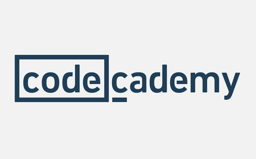
The new wordmark is constructed of two distinct parts that convey Codecademy’s core values. Inspired by programming cues, the word “code” has been highlighted in a frame or field that sets off what the platform is all about. The frame can also be used to hold iconography, programming symbols, or other typography. At the same time, the second “c” is underlined like a cursor, suggesting a sense of open-ended possibility and change, as well as evaluation and exploration. The “cademy” is an educational anchor for whatever is placed before it.
“We love how the identity pairs programming cues (the [code]) while emphasizing the company’s name as Codecademy," says Sims.
The font FF DIN Rounded was chosen for its easy readability and modern look and feel. The new wordmark is set in CoDIN, a modified version of DIN Next that we customized with cuts to the letterforms. The primary typeface for the identity program is FF DIN Rounded Light, with DIN Rounded Regular used as the secondary font.
Codecademy’s user experience focuses on programming lessons as a series of challenges. The designers created iconography for the various programming languages and the badges that users are rewarded when they complete a challenge. The icons utilize characteristics from DIN, connecting the symbols to the identity. We also established a distinctive palette for the site in contemporary hues of blue, mint, red and grey.
The new user interface is designed as a kit of parts that has been applied across the platform for a consistent experience. Clean and minimal, the modular system uses the structure of a regimented grid to tie together the various elements. A UI toolkit and style guide was built for every element on the site, including headers, footers, form fields, button styles, sign up modules and other interactions.
The grid system is organized around a system of graphic “cards” that display user profiles, goals and programming languages. The user profiles display badges for completed languages and exercises, along with progress bars that show the percentage of completion on current goals. Engaging and easy to understand, the interface encourages users to share their experiences with each other and helps build a sense of community and collective accomplishment.
“Codecademy was started several years ago to help anyone learn the skills they need to succeed in today’s digital world,” says Sims. “We think the new identity maintains our sense of approachability while helping to bring together all the work we’ve done over the years with organizations like The White House and Twitter—it’s the perfect match of accessibility, ease of use, and fun in learning.”

