
Citizen Magazine was founded to document Black culture, intellect, aesthetics and nuance, by and for the Black community and anyone interested in culture at large.


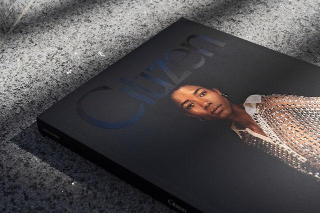
The theme for the magazine’s inaugural issue is “Matter,” relating to the idea of Black lives carrying weight but being denied space, which is organized into three sections: past, present, and future.

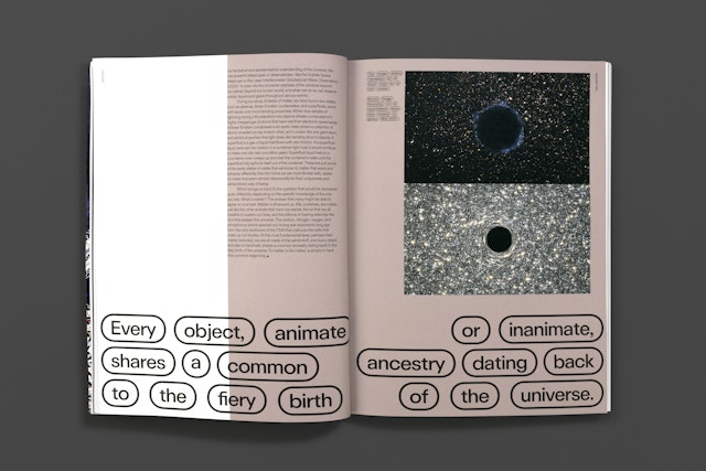
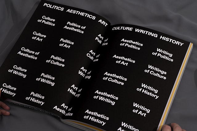


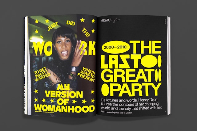
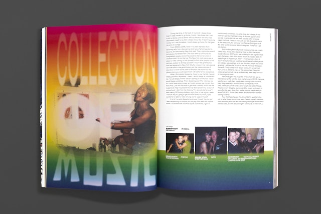

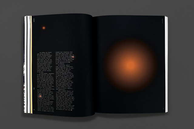
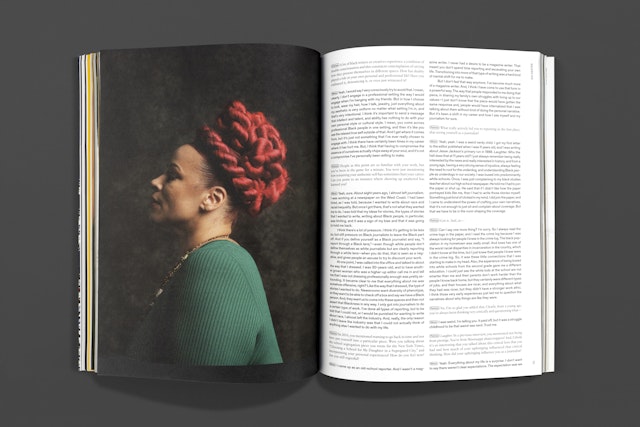
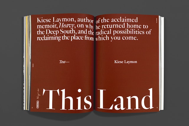


The text of each is typeset in light, medium, and bold respectively, getting weightier as you move through the issue, lending the magazine a feeling of progression.


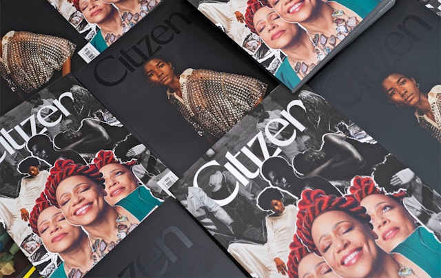
Citizen Magazine was founded to document Black culture, intellect, aesthetics and nuance, by and for the Black community and anyone interested in culture at large. Pentagram Partners Emily Oberman and Eddie Opara and their teams designed the logo, grid, structure, pacing, look and feel of the entire magazine, laying the groundwork for future issues.
“By naming this publication Citizen, then filling its pages with Black images, words, and ideas, each page becomes an insistence and a repeated declaration,” — co-founders Henrietta Gallina and Danielle Powell Cobb.
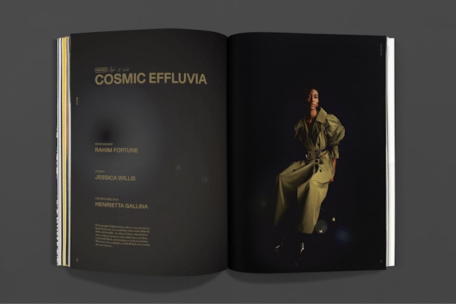
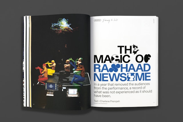
Citizen’s subject matter, from its writing to its visuals, is deliberate, bold, and sharp—an editorial vision that demanded that its design reflect these values. Gallina and Powell intend for readers to consume the magazine slowly, to return to, refer to, and hang on to it over time. The Pentagram teams designed a magazine that is weighty—in both content and actual weight—and has a tangible, authoritative presence. The masthead is the foundation of the magazine’s timeless look: it is a customized sans-serif logotype with a subtle flare. The theme for the magazine’s inaugural issue is “Matter,” relating to the idea of Black lives carrying weight but being denied space, which is organized into three sections: past, present, and future. The design of the magazine is deeply connected to these sections. The text of each is typeset in light, medium, and bold respectively, getting weightier as you move through the issue, lending the magazine a feeling of progression.
This typography sits within a strong and flexible grid, which is a necessity for any good magazine but is especially important here, as each story is treated completely differently from a typographic standpoint. The magazine feels true to each artist and writer while also being an experiential journey through the important content.
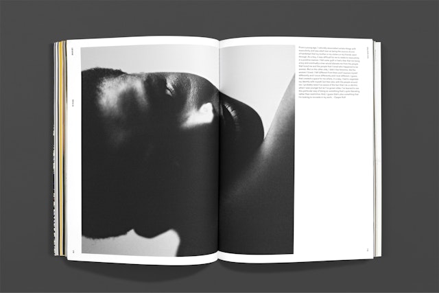
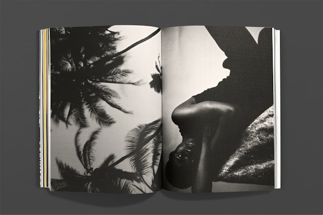
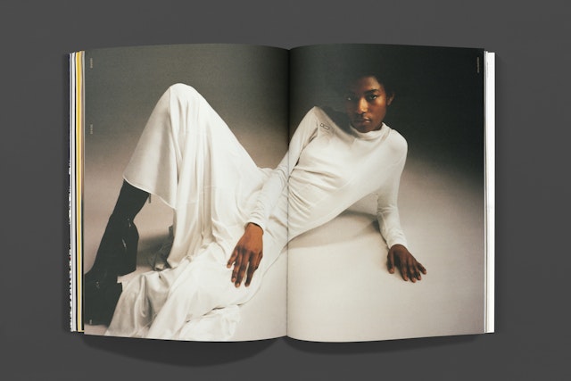
Of course, the main effort was to give the powerful photography space to breathe. There are certain elements used throughout that evoke a bespoke, humanistic experience. Handmade collages, textural film photography, and hand-drawn text and illustrations reflect the vitality of the subjects covered by the magazine, and the collaborative labor of love that went into its creation. The team worked with artist Butler for a set of illustrations, as well as many contributing photographers, giving the magazine a diverse and varied texture.
Office
- New York
Partners
Project team
- Laura Berglund
- Raoul Gottschling
- Shira Inbar
- Lili Phillips
- Issabella Hindley-Cupper
- Zoe Chrissos
- Dana Reginiano
