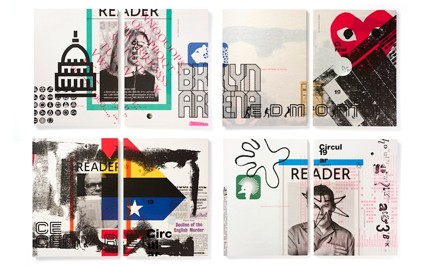
Pentagram has designed 2016’s edition of Circular, the Journal published by The Typographic Circle. This issue is the twelfth designed by Pentagram and marks the 40th anniversary of the volunteer-run and not-for-profit organisation, which aims to bring designers with an interest in type and typography together.
Circular is designed to be an advert-free typographic onslaught, and is filled with oversized typography and foiled page numbers. Its freedom from the restrictions of advertisers means that each issue can be totally unique both in its design and content.
For Issue 19, Pentagram invited some of the world's most influential design and cultural editors to choose a subject which is self-indulgently of interest to them for Circular’s readership to enjoy. These included Jeremy Leslie (MagCulture), Laura Bradley (Dazed Media), Tony Chambers (Wallpaper*) and Adrian Shaughnessy (Unit Editions).
The design of the issue therefore had a slightly disruptive execution with page numbers bouncing around in different sizes and positions against an instructed grid and title layout. Pentagram restricted the typography to a few typefaces and core colours resulting in the final design, reflecting the ambition of the issue (and the organisation) for its mainly design and typographic audience.
This issue has been released with four different covers, each featuring overlaid composites of the articles within the issue, bringing its theme from the inside out. A set of three posters were produced to accompany the project with metallic type over-printing running sheets from the journal.

