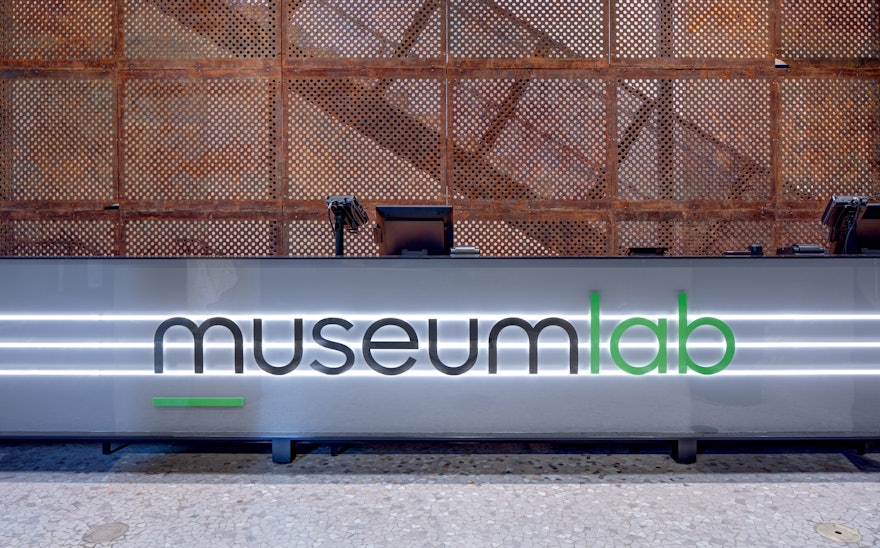
The Children’s Museum of Pittsburgh has launched MuseumLab, a new maker space for older kids in the former Carnegie Free Library down the block from the Children’s Museum in Allegheny Commons. Pentagram has refreshed the brand identity for the Children’s Museum and designed the signage, wayfinding and environmental graphics for the new Lab.
The Library renovation by KoningEizenberg Architecture refurbishes selected areas of the immense 40,000 sq ft building and leaves others in their existing stressed condition, creating what the Pentagram designers called a “beautiful ruin.” The signage program uses a clean, modern design and unexpected industrial materials in contrast with the historic 1890 landmark.
Pentagram previously designed an award-winning program of environmental graphics for an expansion of the Children’s Museum of Pittsburgh in 2004, also with KoningEizenberg, but didn’t create the identity, which had already been designed by another firm. Fifteen years later, the Pentagram designers were asked to update the institution’s identity and create the graphics for the new MuseumLab.
The refreshed identity retools the previous wordmark in a new font, the clean, geometric Sharp Sans Display No. 1. The friendly “hi” in the name is highlighted in color, and a line under the “M” doubles as an anchor and organizing element, also used in an abbreviated monogram version of the logo. Sharp Sans was customized for the Lab logotype, with strokes on certain letters removed for a more streamlined, “mature” appearance, to differentiate the two institutions but still make them feel like part of the same family. The new identity also introduces a broader palette of bright colors, with the Lab appearing in green.
Like the environmental graphics for the Children’s Museum, the Lab signage utilizes inexpensive industrial materials in creative ways. The sleek, elegant design sets off the rough texture of the walls and fits into an environment with an exposed structure and fixtures like steel beams, pipes and electrical wiring.
The signs are designed in strong, simple black and white, with an outline that sets them apart from everything around them. Key signage is fabricated from giant LED bulbs inset in boxes, overlaid with type, and the donor wall features donor names on tubes, framed in a box. Directional wayfinding bends around corners, and the identity is rendered in green neon on the museum façade. The team also created a series of custom icons for the system.

