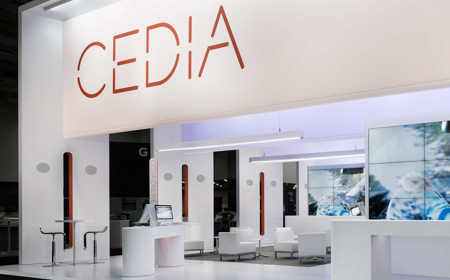
CEDIA (Custom Electronic Design and Installation Association) is the leading global authority in the $14 billion home technology industry, with 3,500 member companies that design, build and install the most advanced residential audio-visual systems in the world. Pentagram has designed an exhibition environment that boldly brought the organization’s new brand identity to life at the CEDIA 2015 Future Home Experience, its annual conference and trade show.
The event was especially important for CEDIA: The association is celebrating its 25th anniversary in 2015, and it chose its own trade show to unveil the global repositioning of its brand and new graphic identity, sharing it with the 18,000 attendees at the expo. The new identity is organized around the brand values of “Vision, Passion and Community,” ideas of connection that embody the goals of CEDIA and its relationship with its members and their clients.
Pentagram's exhibition design dynamically translated these values into three dimensions, simultaneously greeting expo visitors, demonstrating CEDIA’s mission and showcasing the state-of-the-art capabilities of the field. The visual language of the exhibit space was built around a series of four dramatic portals that established a prominent landmark in the trade show environment and provided a platform for the launch of CEDIA’s new identity. It was situated in a prime, central location—at the heart of the custom installation community—and functioned as the venue and main stage for CEDIA 2015 events and business.
Open and inviting, the 50-feet long and 20-feet high portals functioned as gateways into the exhibit space and as architectural "scenic flats" that transformed the booth into multi-functional space. Echoing CEDIA’s roots in immersive audio-visual experiences, the widescreen portals framed the events beneath them, and carried the messaging and color-synchronized lighting that brought them to life and drew people in. The look and feel of the exhibit design extended to the convention center’s arrival and registration halls, creating a cohesive experience of the new brand throughout the show.
The exhibit was oriented primarily to its long aisles, but designed to be welcoming from all sides. Its 10-feet high double-sided media walls and the portal signage, projected messaging, and branding drew people into, through and across the space. The media walls were each constructed of 12 55” LED-backlit ultra-narrow bezel large-screen displays and echoed the cinematic proportions of the portals. Each part of the exhibit was visible from multiple vantage points, and the interior contained spaces for both individual and communal experiences, including a presentation space, demonstration and meeting areas, a lounge and bar. A cool, modern materials palette complemented the elegant new graphic identity by Brick and created a lasting impression of the brand strategy by BrandStrat1.

