Pentagram has designed the publication to accompany an exhibition of painter Cecily Brown at Blenheim Palace. The Oxfordshire stately home, which is the only non-royal, non-episcopal country house in England with the title of ‘palace’, is home to successive generations of the Spencer-Churchill family and their collection of paintings and decorative arts.
Commissioned by the Blenheim Art Foundation, the show marks the first time a painter has exhibited at Blenheim, as well as the first British artist with whom the Foundation has collaborated. For this exhibition, Brown created a new body of work in response to the Palace itself, its extensive collection of artworks, and her own memories of England (she now lives and works in New York).
Brown references the classic masterpieces on view at the Palace, as well as family heraldry, armorial banners and the Blenheim Tapestries (depicting the 1704 Battle of Blenheim) that line the State Rooms. In her conversation with Director of the Blenheim Art Foundation Michael Frahm which is featured in the book, the artist describes wanting to “infiltrate the Palace quite subtly, by quietly replacing existing paintings and weaving my works into the collection”.
Brown chose traditional subjects such as the hunt so that visitors would “do a double-take, to think for a second that my work belongs there, but then to see that it’s a slightly distorted vision of the world depicted around them”. Frahm describes Brown’s painting as going “from figuration to abstraction and back again”, likening their sumptuous colours and expressive brushstrokes to Rubens and De Kooning.
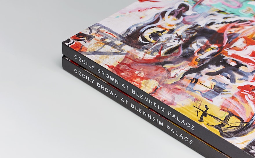
Pentagram was commissioned by the Foundation to design a 128-page hardback book to accompany and record the exhibition. Balanced by generous amounts of white space, dramatic photography of the artworks in situ by Tom Lindboe dominates the book, showcasing the tension between (and also the connection with) the abstract art and the antique interiors. The linen-textured cover features a detail of the artist’s work, with the exhibition's title appearing only on the spine. Rich colours are used for the section openers, and an exhibition plan and a list of artworks appear at the end of the book.
Not a catalogue in the traditional sense due to the exhibition's site-specific nature, as well as containing insights and discourse that put the work into context, the book acts as both a record of and companion to the show. With its expertly curated content, sophisticated design and high production values, it feels like a book that would look perfectly at home on the bookshelves of Blenheim Palace itself.

