The company enables brands with loyal customers, like sports teams, to launch their own credit cards that generate rewards for their fans.

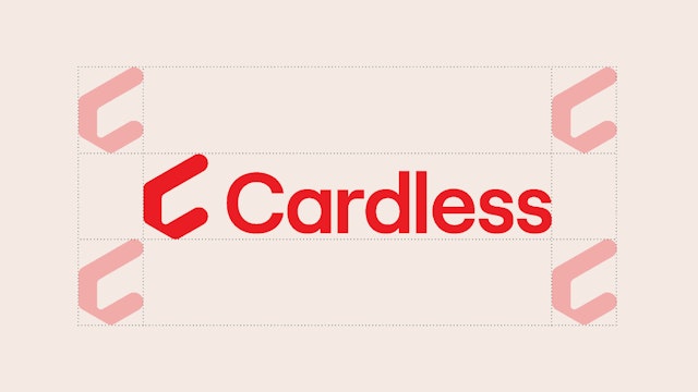



The logo illustrates the brand name and conveys the core brand message—that the future of credit cards is cardless.


The identity captures the spirit of passion and connection at the heart of the Cardless brand.


The website and app have a thoughtful, intuitive interface that allows users to easily track and view their account, rewards and transactions.
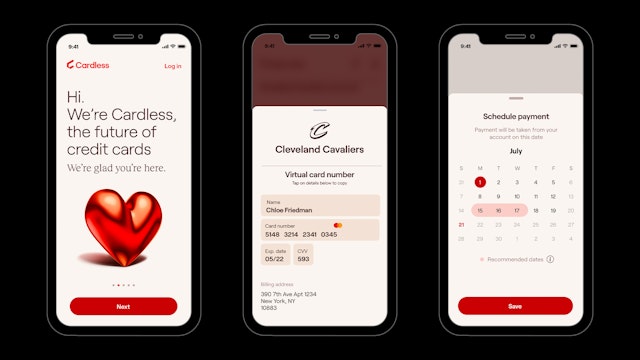


The designers developed a clear brand architecture for pairing the Cardless identity with partner logos, as well as guidelines for the design of co-branded credit cards.
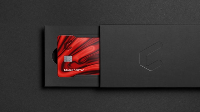
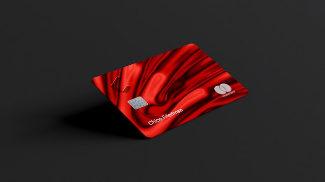


As cashless transactions have become the norm, the role of credit cards is changing as well. The future of financial services is cardless, opening up the possibilities for a new kind of credit card experience. Cardless is a new consumer credit card financial technology firm that helps brands launch and run their own custom co-branded credit card products. Brands with loyal customers, like sports teams, can introduce their own credit cards that generate rewards, merchandise and experiences for their fans, alongside the features they would expect from any other card.
Pentagram has created a brand identity for Cardless that positions the company as the future of credit cards. As part of the project, the team developed brand strategy and messaging that captures the spirit of passion and emotional connection at the heart of the brand and its new way of looking at credit cards.
The Pentagram team collaborated closely on the project with the Cardless co-founders, CEO Scott Kazmierowicz and President Michael Spelfogel, as well as consultant Ilya Mouzykantskii. The company is the first US-based, mass consumer credit card firm to come into existence in more than 25 years. It is also the first to enable partner brands of all sizes and scales to have their own credit cards, including brands with customer bases that are too small for the co-brand card programs offered by major issuers, like the familiar airline loyalty programs. Cardless recently announced its first partnership with the Cleveland Cavaliers.
The company recognized the important role of personal financial services in the lives of consumers. The Cardless model helps consumer brands develop financial products that deepen engagement and foster the sense of connection that is built into being part of a fandom. Purchases earn Cardless points, and the rewards program can be tailored with each brand partner to create thoughtful brand-related perks and awards.
The Cardless name reflects the advanced technologies that work to make managing and moving money safer and easier via the company’s state-of-the-art mobile app. Cardless account holders have access to both a physical and virtual credit card; the physical card is numberless and contactless, and the app offers the option of additional, custom-generated credit card numbers for specific uses.
Cardless offers an entirely new experience designed to change how consumers think about credit cards and personal finance. The Pentagram team, working with strategists Robin Haueter and Melanie Flynn, developed brand strategy and positioning for Cardless that highlights its innovative approach. The company is marketing both to consumer account holders and to potential partners (issuing banks, processing partners and card networks, as well as brand partners), and the branding had to speak to all of these audiences. The team created a brand personality that is warm, effortless and engaging, to build a sense of trust and connection. This starts with the core brand message: “The future of credit cards is cardless.”
Cardless is positioning itself as a disruptor in its category and wanted to signal this with an unconventional identity. The designers developed a high-key look with Pop-inspired flair and bright techno polish that helps Cardless stand out from other credit card brands. This enhanced (or “extra”) visual presence reflects the strong emotional connection fans have for their favorite brands.
The Cardless logo is bold, simple and memorable. The brand symbol is a “C” that suggests an outreached hand holding an invisible credit card formed of the negative space of the open counter. The absence of the card illustrates the brand name and conveys the core brand message—that the future of credit cards is cardless. The wordmark is set in the geometric sans serif Roobert Medium, with secondary type set in the serif Reckless Neue (both from the independent type foundry Displaay).
A distinctive color palette conveys the sense of passion at the heart of the Cardless brand. The brand color is an intense, fiery red that is markedly different from the blues and greens typically associated with finance and banking. The hot red is placed against a darker red for a rich, saturated look.
For the visuals, the team collaborated with Vasya Kolotusha, a Ukrainian graphic artist and illustrator known for striking, otherworldly images that push the boundaries of reality. Items like basketballs and cartoon hearts have been rendered as dimensional objects with reflective, red-hot chrome surfaces. The look extends to backgrounds that resemble molten metal for credit card designs and digital contexts like the app and website.
Cardless is built around partnerships, and the brand architecture had to bridge the unusual three-brand co-branding relationship—between the consumer brand partner, the card network brand (Visa or Mastercard, for example), and the Cardless brand. The designers developed a clear system for pairing the Cardless identity with partner logos in lockups, as well as guidelines for the design of partner co-branded credit cards.
The sleek, elegant simplicity of the identity carries through brand expressions such as credit cards, credit card mailers, promotional materials and the digital design of the Cardless app and website. These digital applications have a thoughtful, intuitive interface that allows users to easily track and view their account, rewards and transactions. Functions in the mobile app are bifurcated: users swipe right for their finances and left for their rewards. A system of custom icons based on the Cardless symbol was created for a cohesive experience of the brand.
Office
- New York
Partner
Project team
- Shigeto Akiyama
- Liam Hamill
- Xinle Huang
Collaborators
- Robin Haueter, strategist and writer
- Melanie Flynn, strategist
- Vasya Kolotusha, illustrator
