Pentagram has designed the new brand identity for Camden Arts Centre, one of London’s most respected spaces for showing groundbreaking contemporary art by both leading and emerging artists from the UK and beyond.
Originally built as a public library, Camden Arts Centre now combines historic architecture with modern gallery spaces, a café, bookshop and a secluded garden. Established in 1965 as a place for making, viewing and discussing art, Camden Arts Centre is known around the world for its progressive, risk-taking approach and bold programming. It has been responsible for introducing many significant artists from outside of the UK and supports artists throughout their careers through its long-established artists’ residencies.
Firmly rooted in the local community, the Centre hosts many free activities and runs an extensive learning and outreach programme. As well as gallery spaces, there are studio spaces for people of all ages and abilities to explore ceramics, painting, drawing and writing. A longstanding champion of inclusivity, the Centre profiles people who are under-represented in the art world (both young and old), as well as running a flagship SEN programme led by artists with additional needs.
The new identity needed to be sensitive towards Camden Arts Centre’s unique history and standing within the art world and the local communities, but raise its profile within both. It was essential to retain the Centre’s unique combination of intimacy and inclusivity, while making the identity work harder on all levels, from business cards to signage and across all of its digital applications.
To achieve this, it was important that the rebrand was an open and collaborative process—as well as looking at the public’s perception of the Centre, Pentagram’s design team worked closely with the Centre’s staff, trustees, as well as many of its artists and patrons.
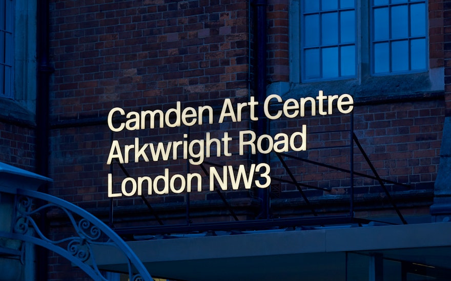
Named after the borough it falls under (Camden—which is also an area of London), but not its actual location (which is in West Hampstead in NW3), the Gallery’s location has been a longstanding cause of confusion. Clarification of this formed the key element of the new identity. The other small but significant change was to streamline the name to Camden Art Centre, emphasising the Centre’s specialism in championing visual art (as opposed to literary and performing arts).
Camden Art Centre’s Arkwright Road address is now an intrinsic part of the new logotype, celebrating its sense of place and cleverly removing any confusion about its location. Inspired by material found in the Centre’s archive, the design team created a new logotype which is clean and understated, referencing its modernist principles. Giving equal weight to each element of its name emphasises its independence and removes any misconceptions that the Centre is funded by the local authority. The intimacy of the logotype with the content of the Centre’s activities and respect for the art it promotes forms the foundation for the whole identity.
The logotype is designed to complement the primary typeface, New Rail Alphabet, which is used solely in Light and Light Italic. A collaboration between A2 Type Foundry and Margaret Calvert, New Rail Alphabet has a uniquely British feel. The original version of the typeface (designed by Margaret Calvert and Jock Kinneir) was used for the Design Research Unit’s rebrand of British Rail in 1965, the same year that Camden Art Centre was established.
A typographic system has been introduced for exhibitions, courses and events—this is a flexible system which allows for the position of the Camden Art Centre logotype to change. Depending on the priority of messaging, it can lead, sign off or support within the hierarchy of information. This system is used for all of the Centre’s collateral, in print, online, on merchandise and on its interior and exterior signage.
Pentagram has created a new identity for Camden Art Centre which is sophisticated and modern, reinforcing the Centre’s international reputation while at the same time remaining confidently understated, leading with art and artists rather than a big brand identity. It celebrates and draws on the organisations remarkable history, while emphasising its integrity and unique place within the local community.
